It's blasphemy, really.
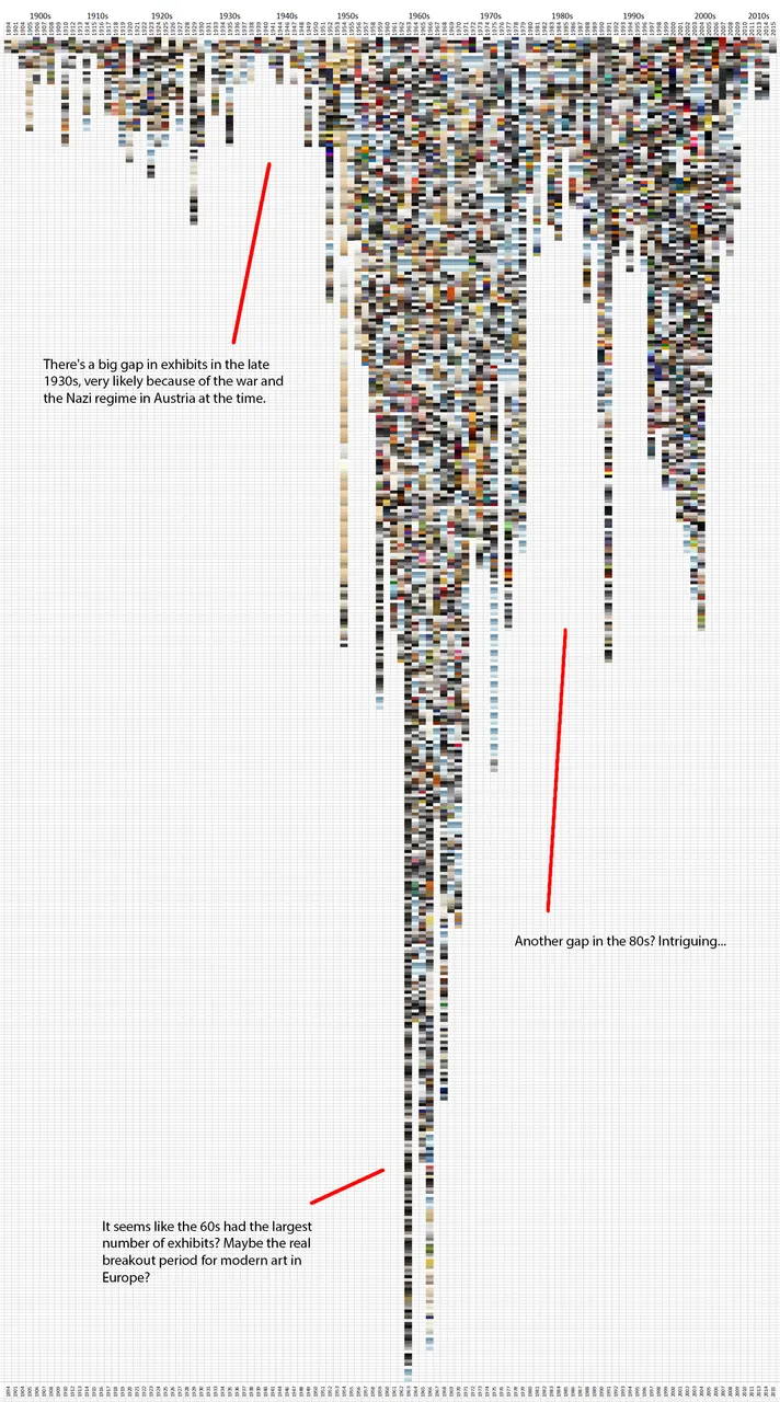
I've reduced around 5000 objects, exhibited at the Museum of Modern Art in Vienna, Austria since 1894. (MUMOK)
To be concise, I've reduced these 5000 exhibits (paintings, sculptures, etc.) to their 5 most commonly used colours and put them in a graph. So each box represents one of those 5 colours, and 5 together make up an exhibit.
Why one might do this? I don't know. It's a bit silly really. But it looks kind of cool and it does tell you a bit about history.
Let me know if you're interested in how I made this, I'd be happy to share my methodology!
All exhibits sorted by year (at the top) and by exhibit name alphabetically.
So pretty random sorting actually.

This time the exhibits are sorted by hue 

And finally, all exhibits sorted by brightness


Can't really draw many conclusions from this little fun experiment with colours and data, but it does serve as an example of how colours and forms can feel completely different when arranged (or sorted) differently :)
I don't post much, because it's a lot of work to make something like this, but If you like these kind of posts, I would be super duper happy about a follow!! 
Thank you and happy steeming! :)