Here's another commission requested by one of my classmate in college. He and our senior are opening a Review Center for Engineering Board Exams at Manila.
At first I hesitated to make one for them because I don't know what to do and I don't have any idea on how to make it a sleek logo. And add to the fact that it's my first time doing an official logo in a software. Back in the days, I only illustrate logi ideas and the masters in photoshop or illustrator will do the rest.

I have other two version:

Process:
The process on making this LOGO is shown below:
I used Adobe Illustrator to make this logo.
I started with the text showing F.A.L.CON and its company type. Century Gothic is the font for the company name then I expanded the text into an object so I can modify the style. Then to make a simple yet elegant look, I used Times New Roman for the font of the company type.

This is where the difficulty started. I wanted the logo to be geometric and simple. So I started with circles, hoping it would show the FALCON's shape.


Then I gave up using circles, so I resorted to the four sided and irregular shapes. I enjoyed making the wings but It looked like a.butterfly, I hoped it get well as the process went on.

And here goes the body and tail, it looked like a shrimp for me.

I tried the other way around and used circle but it didn't work.

So I reverted back to the four sided shapes.

And here it goes, I can see the vody of the Falcon, already, I think I can make it through.

Almost there !!!!
This would be possible without the references I found on google too! I need to see how does a real Falcon is drawn and to see a real image of it.
Thanks also to the pentool it's very handy. And the gradient fill on each shapes! Now that looks sleek.

LOOKS LIKE A ZOIDS TO ME !!! Just add the neck and it is finished. 🐦🐦🐦🐦

🐦🐦🐦🐦
And....
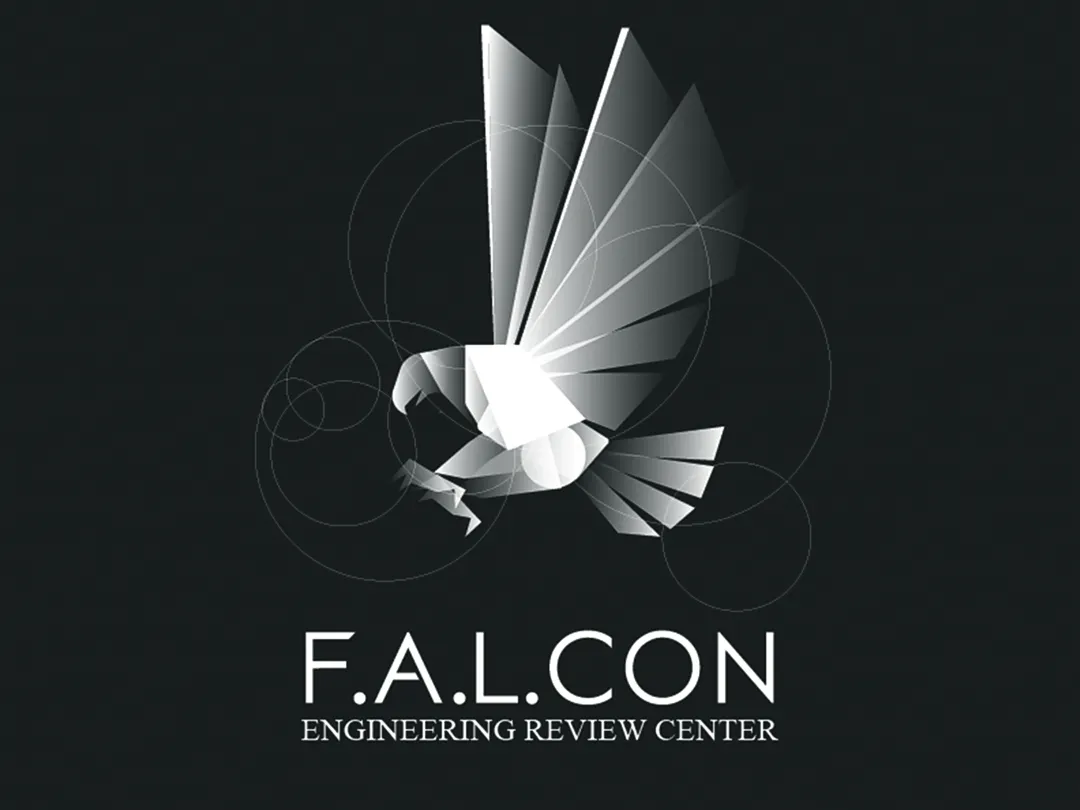
Here's the final logo !!!!
I added the circles I made in the beginning :)

I hope you all like it !!!