Gently Murder Me
Hey, yall! I wanted to break down my process for creating a comic book page and I selected the first page of my chapter of Gently Murder Me that I created with Rebecca Esptein. Gently Murder Me was an experimental diary comic that I was a part of with a bunch of other artists in collaboration with Rebecca. You can purchase the comic here for all of $1 (or more if you wish)
This project was a bit different than most other comics projects. Rebecca didnt give me a script to work of but rather a diary excerpt to create a comic out of. Here is the part of the diary that the first page uses. Only the first few lines are used for the first page. Rebecca didnt break it down page by page but we did go back and forth a lot and collaborated on how the flow of the comic was going to be.
The Words

The Art

The Process
Based off the excerpt, I created some rough layouts for Rebecca to look over. This is the layout for the first page. I've added the second page as well just so you can more of an example as to how this translates panel per panel since the first page has no panel use.
Thankfully, Rebecca was pretty happy with these layouts so it was time to do some real drawing.
One of the benefits of drawing digitally is that you can draw what might get covered up later anyway. This allows me to create a real sense of continuity in objects if parts of them are extended, are covered up and are seen again.
In the next step, I add more details and inking flourishes.
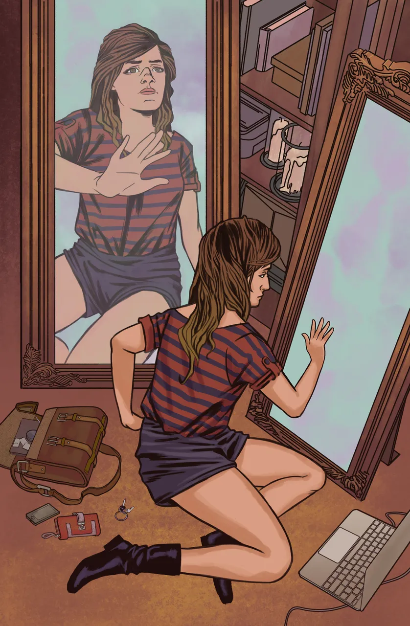
After that, I add in the first 'panel' which is a mirror with the other view of the character and block of the parts I dont need of any given layer with a layer mask. Now that I have all the inks in place, I either lay down color flats which are used to separate objects or I pay someone to do this step for me. I think I had someone flat these pages for me, but this is what it looks like.
Then I copy that layer and switch out those flat colors for base colors I want to use. I think you can really see the page beginning to take shape here into what you see at the end.
At this stage, I create a layer above the base color layer. I use the base color layer to select the object I want, move up to the newly created layer and get to it. I use a number of brushes to get what I want across so its important that I'm familiar with the digital tools I want to use if I want to use them in a consistent manner.
With the majority of the color work done, there are just a few other things to do. In a couple other layers, I add shadows to the shirt, a sheen to the mirror, and add a bit of a red brown gradient to the line work to make it blend in just a bit with the colors.
All that was left was the lettering! Using some scanned in paper texture from an image Rebecca sent me, I created the caption boxes, gave them a bit of a tan hue, added a dark desaturated brown shadow to the boxes. I typed out the lettering using a comic book style font and then wrote over it to give it more of a hand written feel that would be more like a diary and wrote They/Them in a redder color than the rest of the text. And thats it!