What do you notice about the 3 graphs below...
Bitcoin
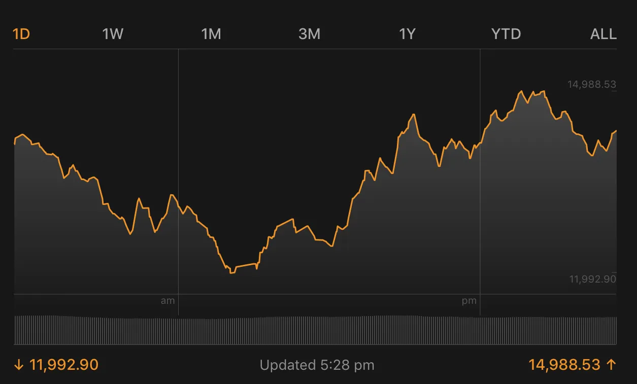
Ethereum

Ripple

... In actual fact, all of the top 10 graphs like identical to these. As do other lesser coins.
What gives?
I've seen this before but today it's even more apparent. Coin graphs that spike... And dip... At the same time.
In surveying the wreckage of the crypto crash, picking over the bones looking for left over discounts, I noticed that every single coin I looked at has exactly the same graph. I went through dozens.
When Bitcoin grows, everything I have looked at is also growing. When Bitcoin dips, everything I have looked at is dipping.
This is handy because it makes it easy to manage my after-crash buys and sells.
Just thought I'd share.
Check it out yourself when looking at CoinMarketCap. Don't just look at your own coins. Look at the ones next door as they may be doing similar things.
Not sure why this is the case. If you know why, leave a comment below and educate me gently.
Thanks for watching,
Brendan Rohan - Indie developer of 'next gen' natural medicine from Melbourne, Australia
Www.Skyflowers.co ( see "botany" tab for the plant research )
Www.ClinicalFlowerTherapy.com
Social @iSkyflowers
YouTube Skyflowers.Tv
If you support natural medicine and an independent research project that began in 1997, then steem me. The creds I get will help me provide a solid body of information that future generations can build upon.
DISCLAIMER: This article is written by an amateur investor and is offered purely for information purposes. This is not financial advice and you should always seek the advice of a finance professional.