The below is an easy way to visualize large amounts of data on one chart - in this case a stream chart. This one in particular shows RSI for a number of large cryptocurrencies since September 2017. What you can see is that in late April, the large cryptos were almost as overbought as they were in mid December - and now they are almost as oversold as they were in mid January.

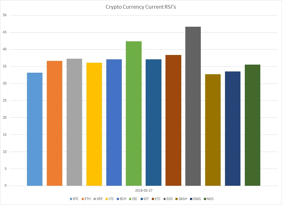
The individual RSI's of each of the Crypto's (as of today) are shown below. You can see all but two of listed ones are trading under 40.
I hope you found this post interesting.
That's all for now.
Publiclunch