Hello friends...
☺☺☺
Welcome back to my blog I hope you are having a good time; the drawing I will share today is the Fraguadora slug that belongs to the fire element. This drawing in particular I can consider it a challenge that I found quite difficult because it has some complicated strokes in addition to the color combinations that was the real reason why I chose it. When I make a drawing that does not belong to a manual or step by step I must guess or find out on my own what colors it should have which in most cases is not easy; at least for me, fortunately I have practiced many color combinations by applying tables of combinations and by repeating them so much some of these combinations I can grasp at a glance.
Next I mention the materials used: white bond paper, pencil # 2, 0.5 marker, eraser and colors (Variety of brands).
Before continuing I remind you that at the end I will leave you the link that I used in this occasion.

Let's start with the step by step drawing:


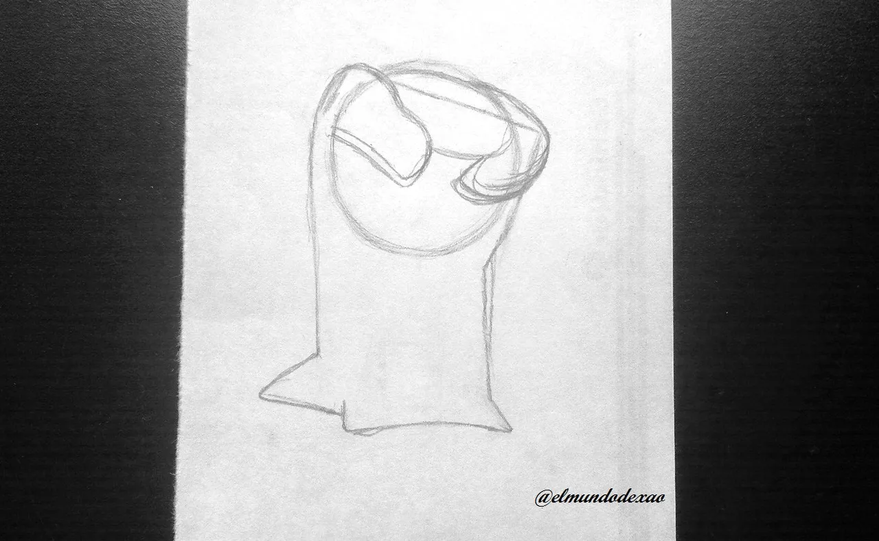
Step # 02: So this time I will make a slightly gridded silhouette and then I will show you why; but to start with the usual circle to orient myself with respect to the head and then the rest of the silhouette will be gridded.

Step # 03: I use the circle and linear strokes to shape the protuberances on the head; these strokes were really difficult to achieve when I tried to do them directly. Then I shape the rest of the body and start incorporating the details.

Step # 04: I erase some excess strokes like the circle to be able to add the eyes and the mouth without difficulty.


Step # 05: Once the sketch is finished I proceed to ink and see if they really have the appearance I wanted to achieve; well yes! Let me tell you that I have been very happy with the results obtained after several days of attempts and now I erase the graphite to appreciate the drawing well.


Step # 06: I start coloring and I do it in the circular part of the head and the three points on the forehead, using a brown tone; for the eyes black in the pupils and the edge will have a touch of yellow and then on top of this a soft brown and for the marks on the back a little orange and then yellow on top. As for the protuberances of his head and part of the face I first place a light blue background and then cover some parts with a grayish blue tone to achieve the shading effect.


Step # 07: For the body I use a soft red tone as background; then I add carmine on the back and base leaving the red tone on the belly and then adding white moving the color in a circular way to give it that effect and to finish I add some ochre between the blue and the red.

Step # 08: For the environment I chose a volcano since that is where they come from and of course the colors yellow, orange and red should predominate.


Step # 09: I finish the rest of the volcano with a grayish tone and for the sky I use various shades of blue degrading them together. Well my friends, I hope you have enjoyed this tutorial and I thank you for reading it, I hope you have a nice morning, afternoon or evening depending on your location.

Photo Source: Own photos captured with a Síragon camera.
Modified size: With the Paint Program.
Thanks for visiting my Blog… AH! Don't forget to vote, reblogear, and comment.
Translated with:

www.DeepL.com/Translator (free version)

Tutorial Paso a Paso Dibujando la Babosa Fraguadora.
Hola amigos…
☺☺☺
Bienvenidos nuevamente a mi blog espero la estén pasando bien; el dibujo que compartiré hoy es la babosa Fraguadora que pertenece al elemento fuego. Este dibujo en particular lo puedo considerar un reto que me resulto bastante difícil ya que tiene unos trazos complicados además de las combinaciones de colores que fue la verdadera razón por la que lo escogí. Cuando hago un dibujo que no pertenece a un manual o paso a paso debo adivinar o averiguar por cuenta propia que colores debe llevar lo cual en la mayoría de los casos no es fácil; por lo menos para mí, afortunadamente he practicado muchas combinaciones de colores aplicando tablas de combinaciones y de tanto repetirlas algunas de estas combinaciones las puedo captar a simple vista.
A continuación menciono los materiales utilizados: Papel bond blanco, lápiz # 2, rotulador de 0.5, borrador y colores (Variedad de marcas).
Antes de continuar les recuerdo que al final les dejare el enlace que use en esta ocasión.
Comencemos con el paso a paso del dibujo:
Paso # 02: Por lo que en esta ocasión haré una silueta un poco cuadriculada y a continuación les muestro porque; pero para empezar lo haré con el habitual circulo para orientarme con respecto a la cabeza y luego el resto de la silueta si será cuadriculada.
Paso # 03: Utilizo el circulo y los trazos lineales para darle forma a las protuberancias que tiene en la cabeza; lograr estos trazos se me hiso realmente difícil cuando los intente hacer directos. Luego le doy forma al resto del cuerpo y comienzo a incorporar los detalles.
Paso # 04: Borro algunos trazos sobrantes como los del circulo para poder agregar los ojos y la boca sin dificultad.
Paso # 05: Una vez terminado el boceto procedo a entintar y ver si en realidad tienen la apariencia que quería lograr; ¡pues si! Déjenme decirles que he quedado muy contenta con los resultados obtenidos después de varios días de intentos y ahora borro el grafito para poder apreciar bien el dibujo.
Paso # 06: Comienzo a colorear y lo hago en la parte circular de la cabeza y los tres puntos que lleva en la frente, utilizando un tono marrón; para los ojos negro en las pupilas y el borde tendrá un toque de amarillo para luego encima de este un marrón suave y para las marcas de la espalda un poco de naranja y después amarillo encima. En cuanto a las protuberancias de su cabeza y parte de la cara primero coloco un fondo de azul claro para luego cubrir algunas partes con un tono azul grisáceo y así lograr el efecto de sombreado.
Paso # 07: Para el cuerpo utilizo un tono rojo suave como fondo; luego agrego carmín en la espalda y base dejando el tono rojo en la panza y luego agregando blanco moviendo el color en forma circular para darle ese efecto y para terminar agrego un poco de ocre entre el azul y el rojo.
Paso # 08: Para el entorno escogí un volcán ya que de allí es de donde vienen y por supuesto que deben predominar los colores amarillo, anaranjado y rojo.
Paso # 09: Termino el resto del volcán con un tono grisáceo y para el cielo uso varios tonos de azul degradándolos entre sí. Bueno amigos así doy por terminada esta publicación espero hayan disfrutado este tutorial me despido agradeciéndoles por leerme, espero tengan una linda mañana, tarde o noche según sea su localización.
Fuente de Fotos: Propias capturadas con una cámara Síragon.
Modificado el tamaño: Con el Programa Paint.
Gracias por visitar mi Blog… ¡AH! No se olvide de votar, rebloguear y comentar.