Hi, dear Hive users!✨
¡Hola, queridos usuarios de Hive!✨

Portada editada por mí en Canva | Cover edited by me on Canva
Hoy quería compartirles algo que me gusta hacer cada semestre y es decorar mi carpeta de apuntes✨. Después de bastante tiempo logré comprar una nueva y me gusta bastante porque es más pequeña y mucho más fácil de llevar que la que tenía antes. Era fácilmente tres veces el tamaño de esta.
Today I wanted to share with you something that I like to do each semester and that is decorate my note folder✨. After a pretty long time I was able to buy a new one nada I like it a lot because it's smaller and a lot more easy to carry along than the one that I had before. It was easily three times bigger than the new one.
Para este semestre quería hacer una portada bonita y llamativa con un dibujo de unos ángeles con nubes además de un lettering falso para el título porque no tengo los marcadores adecuados para eso (para mi desgracia). Pero... Eso no resultó como quería😅 así que me decidí por sólo hacer el lettering falso con unos adornos sencillos.
For this semester I wanted to do a nice and out standing cover, drawing some angels in the clouds and also a fake lettering for the title because I don't have the right makers for that (sadly). But... That didn't turned out the way I wanted to😅 so I decided to only do the fake lettering with simple ornaments.
Primero decidí dónde quería que estuviese ubicado el título y el centro me pareció lo mejor. Allí tracé unas líneas guías que me permiten asegurarme de escribir derecho. Después comencé a trazar los bocetos de cada letra según una referencia de la fuente de letra que quería utilizar.
First I decided where I wanted the title to be in the page and to me the center was the best. There I trace some guide lines to make sure I was writing in a straight line. After that I started to trace the sketch for each letter according to a reference of the font of letter I wanted to use.

Luego remarqué los bordes de las letras con un marcador dorado, borré las líneas guías y procedí a rellenar cada letra. En este caso al rellenar por primera vez el color no se veía muy brillante por lo que esperé un rato y luego volví a rellenar con el mismo color para que se viera más uniforme y fuerte el color. Escogí ese porque a pesar de que el diseño sería sencillo el color lo haría más llamativo.
Then I remarked the edges of the letters with a golden marker, erase the guide lines and proceeded to fill in each letter. In this case when I filled it for the first time the color didn't looked too bright so I waited for a while and then I filled it up again with the same color so it will look more uniform and stronger. I choose that color because although the design was simple the color made it more out standing.

Una vez terminé las letras fue cuando las cosas salieron más y comencé a dibujar esos ángeles que quería tener en la portada pero por descuido manché el dibujo con tinta negra de otro marcador (soy torpe), así que lo descarté pero no quería perder el trabajo con las letras, por lo que las recorté, pegué en otra página y añadí figuras que tuviesen cierto toque elegante combinando líneas rectas y curvas.
Once I finished the letter the things went wrong and I started to draw those angels that I wanted on my cover, but by mistake I stained the drawing with some black ink from another marker (I'm clumsy), so I discarded it but I didn't wanted to lose the work I did with the letters, so I cut and pasted in another white page and added some figures that I wanted to look sort of elegant combaning straight and curved lines.
Nuevamente resalto que aunque simple me gustó como quedó✨
Again I stand out that although it's simple I liked how it turned out ✨
 |  |  |
|---|
Luego pasé a hacer mi horario. Para esto también utilicé líneas guías con lápiz en primer lugar principalmente por asegurarme de abarcar un espacio suficiente para lo que necesitaba hacer. A la izquierda añadí cada hora académica y hacia arriba lo días de la semana. A la derecha unas flores para agregar un detalle estético (o eso intento😂). Ya luego hice unos pequeños cuadros que es donde va cada materia que veré y finalmente remarqué las líneas guías, la borré con cuidado y añadí algo de color y algún pequeño detalle más.
Estoy libre los lunes!!
Then I moved on to my schedule. For this I also used guide lines drawn with a pencil mainly to make sure to use the enough space for what I wanted to do. To the left I added each academic hour and on the top the days of the week. To the right I added some flowers for a more aesthetic detail (or at least I tried😂). Later on I did some small squares for each subject I'll be taking for this semester and finally I remarked the guide lines, erase them carefully and added some color and some other small details.
I´m free on mondays!!
 |  |
|---|
 |  |
|---|

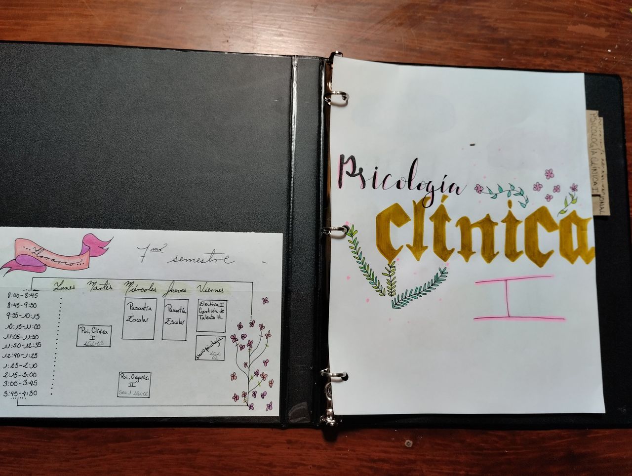
Después pasé a hacer la portada de cada materia más o menos con el mismo estilo. Realicé las letras para cada título con el mismo procedimiento que la portada inicial: líneas guías, trazado, remarcar y rellenar, sólo que para éstas utilicé dos tipos de fuente. Debo decir que algunos nombres eran bastante largos por lo que tuve que abreviarlos de algún modo. Una vez listas agregué pequeños dibujos y su respectivo toque de color. Quería que fueran flores y pequeñas plantas en su mayoría🍃🌸
After that I did the cover for each subject in sort of the same style. I did the letters for each title with the same steps as the inicial cover: guide lines, trace, remark nada fill in, the only thing is that for this ones I used two different types of font. I must say that some of the names were pretty long so I had to somehow shorten them. Once those were done I added small drawings and its respective touch of color. I wanted it to have flowers and little plants on most of them 🌸🍃
 |  |
|---|
Para una decidí usar parte de intento fallido inicial jajaja, así que recorté y pegué algunas de las nubes que había dibujado y apliqué algo que aprendí muy pequeña. Consiste el sacar punta al color pero sólo en la punta de la mina como tal, el color en sí. Con las pequeñas virutas que caen en la hoja se coloca un dedo encima y se hacen movimientos circulares y así se le agrega algo de color sutil a la hoja☁
For one of the covers I decided to use part of the inicial failed attempt hahaha, so I cut and pasted some of the clouds I had drawn and added something I learned when I was little: it consist of sharpen the colored pen but only to the tip of it, the color itself. With the tiny shavings that fell into the page you put your finger on top of it and start doing circle movements and in that way you give some subtle color to the page☁️
 |  |
|---|

Por último quise hacer unos separadores con papel de reciclaje para que fuese más sencillo ubicar cada materia entre las páginas. Sólo tomé el papel, escribí cada nombre y recorté pequeños rectángulos con un poco de espacio en blanco extra para así pegar justo esa parte a la cara posterior de cada hoja. Al voltearla se ve el nombre🌿
Finally I wanted to do separators with recycling paper so it will be easier to find each subject between the pages. I just took the paper, write down every name and cut little rectangles with a bit of extra blank space so I could paste it right in that part to the back part of each page. Once you turn them over you can see the name 🌿
 |  |  |
|---|

Este es el resultado final. Cada hoja tiene un dibujo pequeño distinto y realmente de todas las que he hecho estas han sido mis portadas favoritas. Simples pero a veces menos es más.
This is the final result. Each page has a different tiny drawing and honestly, out of the ones I've done this covers have been my favorite. Simple but yet sometimes it's better the less.
 |  |
|---|
Así que ya estoy preparada para empezar este semestre. Deséame suerte y que comiencen otra vez mis Juegos del Hambre😂💕.
So now I'm ready to start off this semester. Wish me luck and let the Hunger Games begin again 😂💕.
¡Muchas gracias por leer este post! Aprecio cualquier comentario🖤
Thank you so much for reading this post! I appreciate any comment🖤
All pics are my property
Todas las fotos son de mi propiedad
Instagram: @mandismoon