The proposal list feature on cutehive.com has received two small improvements, further enhancing both visual consistency and usability.

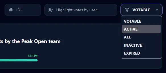
1️⃣ Improved “Votable” Dropdown Styling
This update was inspired by feedback from user 
“Votable drop down (proposals page) on Cute Hive stays white in dark mode, making it hard to read.”


After reviewing the issue, I found that it was not limited to dark mode. Even in light mode, the Votable dropdown did not fully align with the overall page style and appeared slightly inconsistent.
The dropdown styling has now been refined to:
- Properly adapt to dark mode
- Improve appearance in light mode
- Better match the overall page design
- Enhance visual consistency
The result is a cleaner and more polished interface.

2️⃣ Click Anywhere on the Proposal Card
Previously, viewing proposal details required moving the cursor to the far right and clicking the small link button. While functional, this required extra mouse movement and precise positioning.

To improve usability:
- The entire proposal card is now clickable
- Clicking anywhere on the card opens the proposal details
- The voters button functionality remains unaffected
Browsing proposals is now faster and more intuitive.
Our Commitment
We always value:
- User feedback
- User experience
- Attention to detail
We will continue striving to provide the HIVE community with tools that are more beautiful, intuitive, and enjoyable to use.

🔗 Direct Link
Click the link below to go directly to the proposal list page: