
A full breakdown of everything we shipped in the latest update.
We have been quietly working on HivePostify behind the scenes, and today we are ready to share everything that changed. This update touches three major areas: a new saved posts feature, a completely revamped image system, and a cleaner, more focused Explore page.
Let's go through each one.
🔖 Saved Posts, Your Personal Reading Shelf
The problem we wanted to solve: You scroll through the Explore feed, find a post you love, and then lose it. There was no easy way to come back to it later.
That's changed now.
Every post on HivePostify now has a save button on the post card. One tap, and that post is stored in your account. All your saved posts live on a dedicated page:

👉 https://hivepostify.cloud/saved

The saved posts page is clean and simple—just your bookmarked content, in order, ready whenever you need it. You can save a post for reference, to respond later, or simply because you liked it. There are no rules. It is your shelf.


🖼️ Images Are Now Fully Self-Hosted
This is one of those changes you might not notice immediately, but you will feel it.
Previously, HivePostify relied on third-party image services to load and display images. That created a dependency we did not want. If those services had downtime, images broke. If they changed their policies, we had a problem.
That dependency is now completely gone.
Every image uploaded through HivePostify is now:
- ✅ Stored on our own servers
- ✅ Automatically compressed to .webp format for smaller file sizes
- ✅ Served faster, with no reliance on any external host
The result is a noticeably quicker experience across the whole platform. Pages load faster. Images do not disappear. We have full control over reliability.


Explore Page, Cleaner Layout, Better Sorting
The Explore page at hivepostify.cloud/explore has been completely redesigned.

If you have never visited HivePostify before, the Explore page is your front door. It showcases 32,100+ published articles from writers and creators worldwide. You can browse by category, discover new voices, and see what the community is discussing today.

Here is what changed in this update:
- Post cards are now easier to read thanks to improved spacing and typography.
- Category filter chips are at the top, letting you jump to any topic instantly: Technology, Travel, Photography, Finance, Art, and more.
- Sorting has improved, showing the most relevant and recent content first, not just the newest.
- The overall page feels lighter and much less cluttered than before.

Whether you are a returning user or visiting HivePostify for the first time, the Explore page now provides a much cleaner view into 8,700+ active creators publishing real content every day.
Noted
This Details Fill Only For Best Impression On Visiter... Its not Accurate.
✨ Welcome Popup, Redesigned
First-time visitors now see a refreshed welcome popup when they land on HivePostify. It clearly introduces the platform, highlights the key features, and gets out of the way quickly.
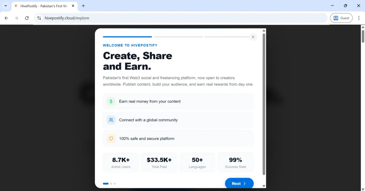


It features a clean header, three key features explained, and two buttons Get started or Maybe later. That's it. Simple and to the point.
What's Next?
These updates are part of a larger effort to make HivePostify the smoothest, most reliable way to publish on Hive. We are making updates regularly, and every piece of feedback from the community shapes what we build next.
If there is something you would love to see added, drop it in the comments below. We read everything.