
This is a really long post with lots of images. However, considering how much time it took to paint this, I really wanted to do the painting justice. ^^
I've done a lot of less detailed art so far, but I really felt inspired to make this painting. This inspiration kept me going hour after hour, especially when I felt stuck.
I'm still holding the giveaway on Twitter, (you'll need ETH wallet if you win). I've asked my sibling to help me pick the winner, since there are so many cool entries already. ^^ The other 2 editions of this painting are open for bidding ^^ I won't rush this auction since I'm quite attached to this painting <3 The giveaway ends in a few more hours (4-5 from now) _

Full Story: https://knownorigin.io/gallery/206300
Click the small expand button to read the full thing.

I work a little chaotic, following my inspiration :) I actually thought I could preplan this drawing like other "professional" artists do, but it just didn't feel right for me. my brush strokes felt rigid, and lifeless, and it didn't feel fun. I added perspective too soon and that just make feel me too self conscious about mistakes. So, I decided to go back to my method of colors> composition> details> values. I'm really surprised how well this is working for me, no matter what I paint (including portraits even).

I've been researching a lot art with shiny/gold effects and I really wanted to try it out. I started with actual gold hue, but I didn't like it. Personally I've always preferred Pink gold over traditional yellow one. I used color balance to get a more gentle color, I find Color Balance much more useful than Hue/Saturation adjustment. I've noticed the paintings and colors look more unified and blended together. Also once you get a hang of it, it's much easier to control.

I tried to make the constellations as varied as possible but also balanced. I've gotten more comfortable painting circles in perspective thanks to this painting- The Spiral Fountain. I used the perspective grid as a part of the painting so it looks like tiles, but the secret is- it helped me draw the circles ;) You essentially need to fit a circle in a square that's in perspective, you can see the example above. I eyeballed most of the circles after that, and when any felt "off" I'd fix them and check the grid. Initially it took me a while to get the right perspective that I wanted, but it was worth it later. My first perspective was too wide so it didn't feel grounded, so afterwards I used a separate layer so if I change my mind, I don't have to spend half an hour fixing my mistakes. The important thing to remember about perspective is the horizon, I prefer keeping it at eye level, but if you put it higher or lower you can get interesting effect: lower horizon= looking down at something also sometimes called bird eye view. Higher perspective= looking up at something, great if you're drawing a tiny character, or a massive building.
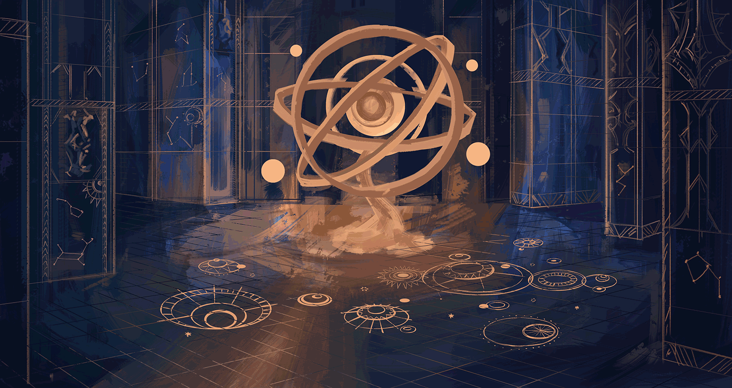
I tried to not overfill the floor with details, because it can get confusing for the viewer. I used a flat color, but later I'll blend the details with the background more, only accentuating some areas. I achieve the reflective gold by using a separate layer and a mask. I painted lighter and darker "bands" vertically. The stronger the contrast, the shinier it will look. Also I added the little 4 globes so that the place looks more magical, since they're floating in the air on their own.

A couple of weeks ago while doing some research, I discovered that this globe kind of thing is called Armillary, I highly recommend checking out some pictures, they're all so gorgeous! I considered animation but I don't know where to begin, I still need more practice. I felt a simple glow effect wasn't enough and I've noticed gif-s tend to compress art quality.

Checking values- This part is easy but sooo important. I use a black layer set to "color" layer adjustment. Then I use overlay, multiply and brightness/contrast to make the painting more readable. Above you can see me testing various contrasts that affect the composition and focus greatly. The colors are basically the same but their brightness is different.

Details- little details like the blue light in the background, really make the painting look more complex. Details take the art to the next level, but it's important where you add details. I kept the walls vague, because I didn't want them to be the focus. I also removed some of the contrast on the floor details, so it's not too distracting. Last, but not least, I added the Armillary reflection on the ground, to make the floor feel even more shiny. It's barely noticeable at a first glace, but one you see it, it really fits.
Feel free to ask any additional questions, I'll do my best to reply _ I might be afk for the following couple of days, so I'll catch up once I'm back.
Ps. You can check out this painting in the #sheart exhibition here: https://www.cryptovoxels.com/play?coords=E@108E,6U,349S
And check the rest of the awesome artworks while there ;)

I'll probably make a post just about the exhibition next week when I'm back ^^
Dragon head winners: my blog: 

Thank you so much for checking this post out <33333