


''''
Hi Guys, continuing from where I stopped thanks to the feedback I got from 

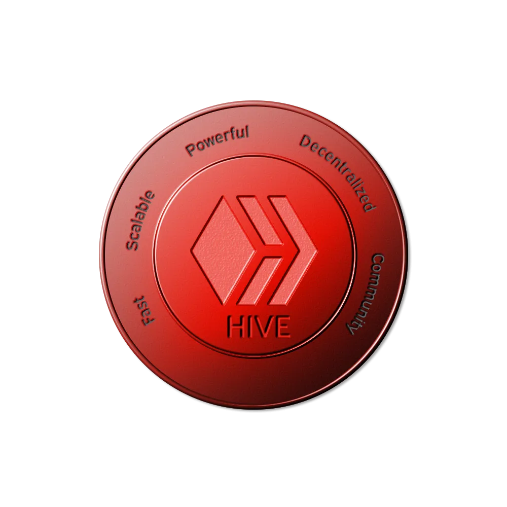
I like the last coin most, I like the blackness.....
Like I said I might be dropping a lot these, I mean different variations, ever tried googling Ethereum or Bitcoin and see all the images that pop up? Thats how I want it to be for Hive as well, and if these are the coins people will find, thats fine by me, so these images are totally free to use by anyone, though I still think they arn't perfect yet.
Which is your fav and why? Do you think I should change anything.
p.S
Did I mention that my photoshop skills were self learnt? I don't know how to use core draw till today and people say its better, well I feel I can find my way around easier on photoshop.
So anyway, I'd probably be working on more dope looking tokens like all those ones that have luminous lights in them.
Kindly leave a comment to share your thoughts, thank you for viewing....,