
Saludos hivers; seguimos con el efecto Cyberpunk para aplicarlo a todas las modelos 🤣. Se nota que este efecto me gustó.
El turno de hoy le tocó a Bárbara quien realizó varias sesiones conmigo. La foto pertenece a esta sesión
Greetings hivers; we continue with the Cyberpunk effect to apply it to all models 🤣. You can tell I liked this effect.
Today's turn went to Barbara who did several sessions with me. The photo belongs to this session
Foto Original

Como siempre comenzamos por retirar a la modelo del fondo. Para eso utilizamos la herrmienta Selección Rápida y seleccionamos el fondo para después darle "Invertir" y copiar esa capa usando el comando, control + J.
As always we start by removing the model from the background. For that we use the Quick Selection tool and select the background and then we "Invert" and copy that layer using the command, control + J.

Una vez que tenemos a la modelo separada en una capa; vamos a crear la inicial de su nombre, en este caso la letra B. Usamos la herramienta pluma para realizar el trazado y convertirlo en una forma que podamos usar cuando queramos.
Once we have the model separated into a layer; we are going to create the initial of its name, in this case the letter B. We use the pen tool to make the path and turn it into a shape that we can use whenever we want.


Recuerda duplicar la capa de la letra, una vez que tenga el degradado y esa nueva aplicarle un desenfoque gausiano.
Remember to duplicate the letter layer, once it has the gradient and apply a Gaussian blur to the new one.

Después con el pincel y el grosor que elegimos, vamos a trazados y selecionamos contorno. De esta manera le daremos un borde a la letra y no tendremos relleno.
Elegimos en fusión a superposición de degradado de azul a magenta con inclinación de 0 grados. A esta capa la ponemos en modo de: Linear Dodge (Add) y el relleno lo colocamos en 0%.
Then with the brush and the thickness we chose, we go to paths and select outline. In this way we will give a border to the letter and we will not have a fill.
We choose in blend to gradient overlay from blue to magenta with a gradient of 0 degrees. We put this layer in mode: Linear Dodge (Add) and set the fill to 0%.

Aplicamos un desenfoque gausiano al fondo y lo oscurecemos. Después en una capa nueva vamos a pintar de negro la letra para que tenga más fuerza y contraste.
A la modelo le quitamos la saturación para dejar en blanco y negro y ajustar las sombras.
We apply a Gaussian blur to the background and darken it. Then in a new layer we are going to paint the letter in black to give it more strength and contrast.
We remove the saturation from the model to leave it in black and white and adjust the shadows.
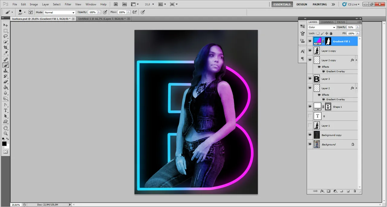
Despues con una capa de ajustes de degradado; realizamos el degradado de azul a magenta igual que con el modo de fusión pero con un degradado sólido y usando los mismos colores. A esta capa de ajuste la ponemos en modo de "color".
Al fondo le colocamos unas pinceladas de los dos colores usados y le aplicamos un filtro de desenfoque radial...
... y listo XD
Then with a gradient adjustment layer; we make the gradient from blue to magenta as with the blend mode but with a solid gradient and using the same colors. We put this adjustment layer in "color" mode.
To the background we place some brushstrokes of the two colors used and we apply a radial blur filter...
... and that's it XD
