Yesterday I visited a new exhibition and again, I went there blindly, having no clue about what I'm going to see, which is my favorite way of visiting exhibitions. The element of surprise has to be there and the less I know, the more surprised I can be and that's exactly what I got yesterday.
There's always a poster at the entrance, but if you don't know the artist, which is the case 99% of the times, you don't know what to expect. This time it was a solo exhibition of Enikő Bíró Kálmán, a very talented artist in my eyes, with a very unique style I've never seen before. The keyword here is again, out of the box.
To me, creating artwork mainly means that I practice my interpretation of the visible world and I also practice seeing it as a whole. In this, I am helped by intuition but also awareness, spontaneity and planning ahead, play and effort as well. For this reason, I make series to help me meditate and refer to the integrity of the world, which I crave. source

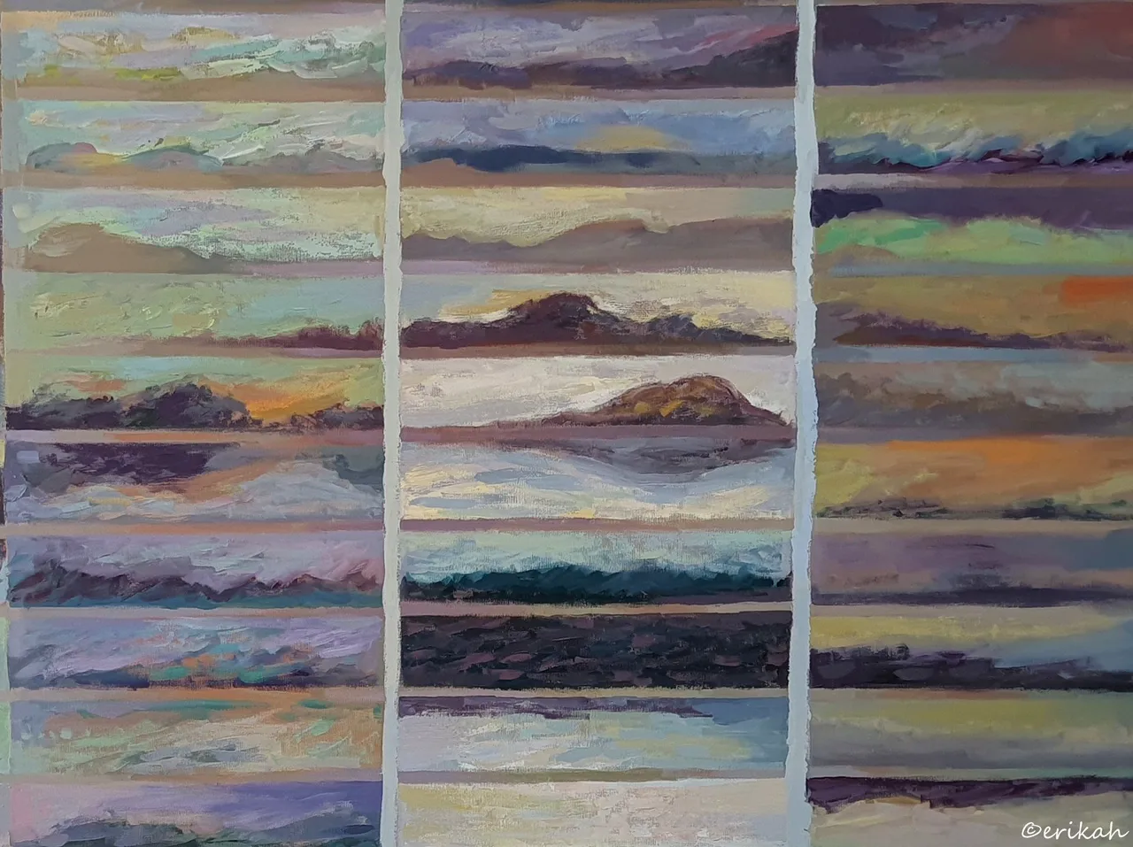
Chromatic Memory Exercises - Disintegration
This was the first painting, or watercolor I saw and knew right away this visit is going to be memorable. I stood in front of the painting, looking at it for a few minutes, trying to memorize it, burn it into my memory.

It may seem simple, or even meaningless, but it's not, trust me. I had to crop the photo to be able to show you the details. At first I thought the artist used some kind of grid to limit the paint spreading, but at a closer look, there's no way she did that. Most likely there was a grid drawn on the paper, but the rest was done without any aid material.
So what does Chromatic Memory Exercises mean? Lucky me, or lucky us, I was able to find the artist's website, so here's the explanation for you.
Not long ago, I made a discovery: rather than mere decorations, stripes in traditional homespun materials served to pinpoint the number and size of the estates in the ever-attentive, approving or disapproving gaze of the community. This banal information triggered me to survey my "possessions". Mine is all that I can bring up from my memory: the colours of my scenes. The first evoked chromatic memory, accordingly, is a colour guide similar to a simple factory color sample, which I tried to paint as accurately as possible.
However, memory creates intricate relationships and, allying with technique, confers new meanings to things we have known in a certain way. That’s how watercolors like Jacob’s Ladder, Stirring up the Water and Depth were born and then, in quick succession, the rest of the series. They were created with pure pictorial tools, releasing colour from formal restraints, then giving it a new form relying on, as well as based on, its emotional content. Rhythm as a structure-generating principle, also working in music, has been decisive: it equally exerts its effect in time and space; also, it has been able to organize stable elements (form-colour scale cells, the line grid) and an ever-changing, spontaneous processes (color patches) in a unity. They are now elements set in a disciplined order, formed of bands, organized similarly to musical structures. So the image is embodied in the tension between these two constants: rhythm and technical necessity. The line grid, as the image of the silence between the sounds, the expression of the invisible, immaterial, timeless, separates but also connects. source

Chromatic Memory Exercises - Rust
Being an art lover doesn't mean you're an artist too, so when I look at an artwork, I see it and interpret it in my own way. This piece however totally charmed me. The color combination is what makes me like it so much. It is called rust and I can see why.
Some of you in the Photography Lovers community know I'm a huge fan of rust and one reason why, is the color rust produces. Don't ask me to describe the color of rust as one word is not enough and this painting shows the colors better than words can ever describe it. If you're familiar with rust, you know you can find all these colors in a rusty surface. Now think about it, who would think of creating a watercolor painting with these rust colors? Not many I think.
My layman mind however works in a mysterious way and apart from the obvious painting, I saw something else, or better yet, I thought about something else. Lately, when I'm looking at abstract paintings, there's one thought in my mind, which is, the pint I am seeing, would look great on a fabric, which can be used to make a T-shirt, or a top for women for example. It's a crazy thing and it always pops in my mind spontaneously. This for example would make a nice top I think.

Here's a cropped part of the painting. In terms of color and pattern, each box is different and there are so many boxes on that paper. Imagine the creativity the artist had.
I wouldn't be surprised if some of you ladies would see a make-up set here, especially an eyeshadow set 😁.

Nostalgia
Same concept I believe, but done with acrylic painting, which changes the game considerably. While watercolor is spreading on paper on its way, creating unimaginably beautiful patterns, acrylic works differently and the design is the merit of the painter's dexterity and imagination.
Nostalgia can mean a number of things, but what I think I see in these boxes could be landscapes.
What do you see here? Or what do you think you see? 😃


Rust
My experience with watercolor is minimal, almost non existent, but I think the beauty of it is that you can't create the same pattern twice, even if you're using the same technique, you get a slightly different pattern.

Rust
A slightly different interpretation of rust, but just as important as the previous ones.

Segments

Forgetting Exercises
Up until now we were talking about Chromatic Memory Exercises. This is the exact opposite of it.
After leaving the gallery, I was thinking that imagination and creativity have neither limits, not borders. When you think you've seen it all (not my case), there is another artist to show you there are no limits in creativity. This series is proof of that.
This was just a part of the exhibition, that refers to the Chromatic Memory Exercises. The other part of the exhibition had a different topic, very interesting as well. I'm going to post about it at a later date.
Last, but not least, this part of the exhibition was almost exclusively about colors and shades. It's all nice and good but I know there are people living with congenital red–green color blindness, or are totally color blind. I haven't met anyone on Hive yet with either of these conditions, but with such a large userbase, I bet we have a few of them. Let me know if you're one of them and share your experience, tell me how you see these paintings.

If you're a newbie, you may want to check out these guides:
- Communities Explained - Newbie Guide
- Cross Posting And Reposting Explained, Using PeakD
- Hive Is Not For Me
- How To Pump Your Reputation Fast - Newbie Guide
- Tips And Tricks & Useful Hive Tools For Newbies
- More Useful Tools On Hive - Newbie Guide
- Community List And Why It Is Important To Post In The Right Community
- Witnesses And Proposals Explained - Newbie Guide
- To Stake, Or Not To Stake - Newbie Guide
- Tags And Tagging - Newbie Guide
- Newbie Expectations And Reality
