To make good business decisions, one must have access to information that can supply answers to problems met. However, for stakeholders and other people involved who work outside of the company who do not have the background to understand what all these numbers mean, creating dashboards and reports that are easy to digest are what is needed for a common person. There are many applications that can do this task efficiently but one of the more well-known software is Cognos Analytics. Cognos Analytics is a reporting, modeling, and analysis tool developed by IBM. Commonly used by businesses to aid in creating decisions that can improve a system. Before defining functions available on this software and how it all works, it is good to note that Cognos is a paid service and is also available via cloud. This means there might be some functionalities unavailable from the trial version offered. Furthermore, just like any other service, Cognos updates and is available in many versions. Which means if working on different computers and different software versions, there will be noticeable differences, but they will still function like they should and can be used the same way. The free trial version available on cloud will be used as basis for this.
Opening the application, the first interface that will show up is the home page. This is where the side bar navigation that holds the buttons that allow a user to create, upload and view content can be found. The top navigation bar can let a user view and access their personal menu, notifications, assistant and the search function. In the main area of the homepage, an Introduction to Cognos Analytics can be found, especially for first-time users. Moreover, other than the side bar navigation, uploading and viewing data can be done here as well. Existing content is also displayed and arranged by when it was last accessed (Recent) or if it was tagged as favorite.

In the side bar navigation, the first button seen after Home is + New. What is displayed on the screen once clicking it are a variety of file types one can create in Cognos. Namely, Data Module (Data), Exploration (Explore), and Dashboard, Report, and Story (Present). First on the list is Data Module. A data module is a data file used to create dashboards or reports. What sets this apart is that this file has relationships between data, which for some people may know as either hierarchical or relational. In relation to similar concepts, this is where you can see a table's primary key and its foreign key in another related table. The following after Data Module is Exploration, which is found under the label Explore. In Exploration, after choosing a data source, discovering and analyzing data can be done. Once opened, suggestions are displayed as guides and visualizations may be changed based on what is needed. The photo below shows an example of an exploration.

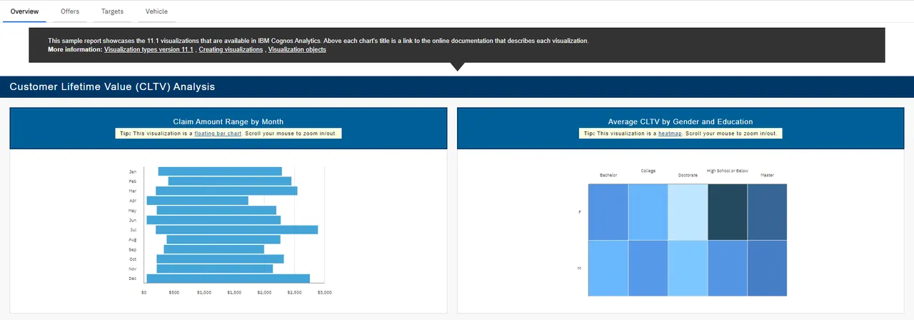
To present findings in data, a user may opt to choose any of the following: Dashboard, Report, and Story. Dashboards are a wonderful way to visualize data to make it easier for not only people within an organization to easily understand patterns and relationships in the business, but most importantly stakeholders who may not have the business knowledge to easily digest this sort of information. In this feature, it allows for a wide array of customization options for your data, which in this case may be data uploaded (CSV, Excel, and the like) or data modules. Customization can be diverse types of graphs or color schemes. The example below presents a dashboard that has different graphs and tables that are Video Game Sales.

Another way to present data, specifically data modules, is through reports. In comparison to dashboards, reports are a way to present greater amounts of information as they are more detailed, in a quicker-view manner. Dashboards are typically broader and present a summarized representation of information. For reports, it allows for a more comprehensive portrayal of data. It has a view of historical data or data at some point. Other than the differences between both visually, in the point of view of end users, dashboards already show someone specific insights while reports a user must create the insights themselves.
Lastly, part of data visualization is Stories. The photo shows us the different options that are available if a user opts to create one. Stories are used to create data visualization narrative. These narratives can help people understand more about what happens and aid in supplying conclusions and even recommendations in the end.

Other than creating new documents, a Cognos user may also access Content, which is somewhat like a file explorer where files can be seen. This also goes the same for Recent, which holds files arranged by which was accessed last. Furthermore, in Manage, this is where users can view the following options, People, Data Server connections, Customization, Collaboration, Storage, and Secure Gateways which can be used to their liking.
The use of such a powerful data reporting tool, such as IBM Cognos Analytics, is a wonderful way to discover new ways to present and understand organization data.
Posted using Honouree