A new season 
We now have more time to edit the photos. And that would work if you didn't get distracted by the other games that are going on (the #whatisit, #photogifgame and #photogamesportrait).
The game is growing. More and more people join! And with the impressive price money (over 110 SBD), this makes absolute sense.
Let me walk you through my edits... Again, as usual, this will be completed in the coming days.

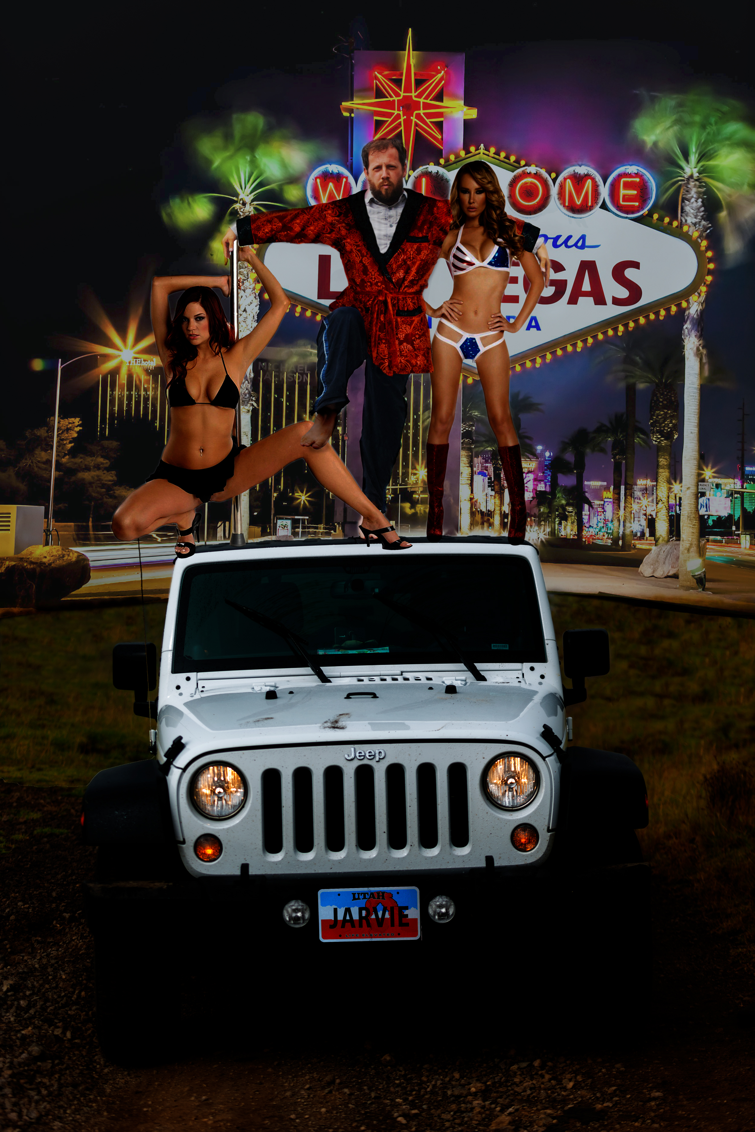
@jarvie

And before I knew it I thought Vegas and strippers. I got a little nervous if it wouldn't be too explicit and crossing a line (you post it on someone else's blog). So I checked if strippers were okay before editing.
Good to go! And as you can see a lot has been done to poor
First came the background. It needed to be obvious that it was Vegas. The grass field in the foreground of this photo was just perfect (and the sign is super obvious). Again, I used layer multiplication to fix this. The colours were pretty weird and the grass needed some blending.
The only way around it was to darken the stuff. There might have been a better way which I learned during the 
The idea was to have 2 girls like the right one, standing next to him. But as soon as you start searching for photos, plans change. I found a girl on a pole that could work. What if
But
The most work I had on this edit was me getting lost in all the masks. I am not super organised so I don't name my layers properly. And before you know it you have no clue what layer you are working on. Especially around the knee, arms and robe, I got a little lost. But it was worth it.
Final touch? The license plate... A guy like this must have his own so I introduced a Utah plate with JARVIE on it. Five minutes work (for the plate!), a bit of a laugh added.
 Original
 My edit
@vmoldo

magic. You correct a little (and clean your laptop since it refused to do it due to lack of space).
It was only when I saw the full panorama that I realised I could turn this into a #tinyplanet. Since I have done some research on how to do this for a contest, I didn't need much help anymore. But found a short 5-steps guide that helped me not forgetting steps.
All you need to do next is stitch both sides more seamless. A little skewing on one side will often do half the trick. The rest can be fixed with the healing tool. I added some darker corners and my job was done.
 Original
 My edit
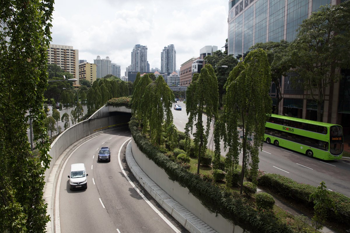
@skiesandsports
I was looking forward to editing this photo so much!
If cars are flying, who needs roads? So step 1 would be adding a river to the city where once the road was. I tried multiple tutorials but ended up with this one: how to create water reflections. Creating the reflection in the river was a bit harder than it would if it was a flat lake with an even shore. I still need to figure out the best way to do it. Probably cutting the area around the water, flattening it, flip it and skew it into place with some blur. But I was happy enough with this as a start.
The water needed a boat. And before I knew it I had a boat, a bus and a flying car (because... that was my initial idea). But while googling futuristic and sci fi cities, I noticed some fun things that you can do with light in the future. And I really wanted to include that. So I tried turning day into night. It was soon clear that the vehicles needed some light to look active and that was also part of the tutorial. At this point, I couldn't count the number of layers anymore and decided to start organising them in groups 😉(victory!). I added a few futuristic buildings in the background and did the air-light effects of the city.
And then I had it, my night edit of this city. But I wasn't happy with it. There were elements in the day edit that I liked and bits in the night edit. And I remembered a guy showing the difference between 2 of his day/night edits with a slider which looked pretty cool. Maybe I can do that same trick and store that as a GIF? And as always, Google is your friend. It was a bit of a struggle finding out if and how that would be possible in photoshop (or any other tool). But with some frustration, I finally managed to get this to work. As soon as you have figured out how to do it, it suddenly feels so easy!
 Original
 My edit
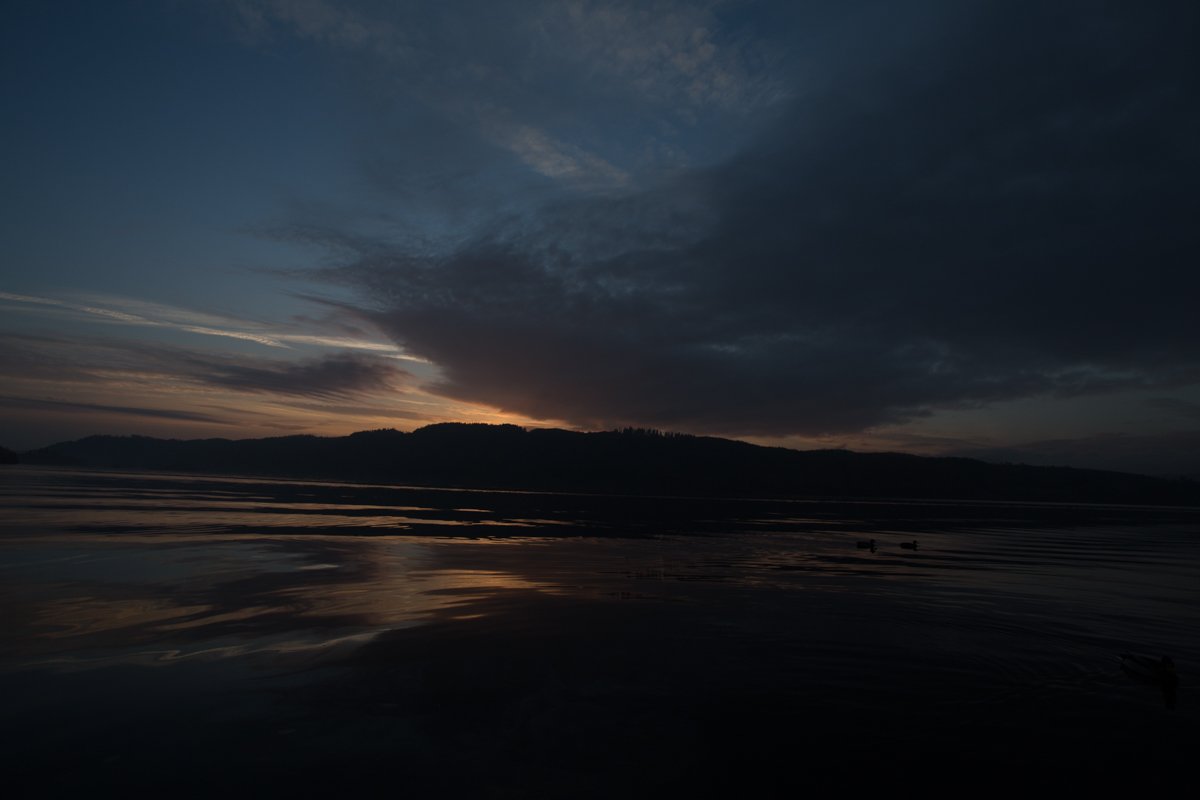
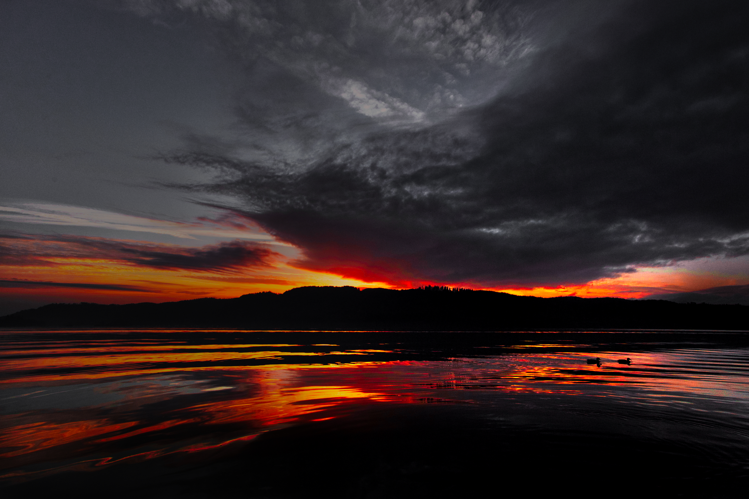
@vtravels
My first edits all looked the same like all the others. But whatever I tried, it just didn't work. I wanted the hills to stay dark. But I also didn't want to photoshop this one into something completely different. It is just not that kind of photo.
So I flattened the horizon and sadly had to remove the duck in front. I over-intensified the orange colours and removed all the blues. The result? You might love it or hate it. There is probably nothing in between... At least it is different.
 Original
My edit
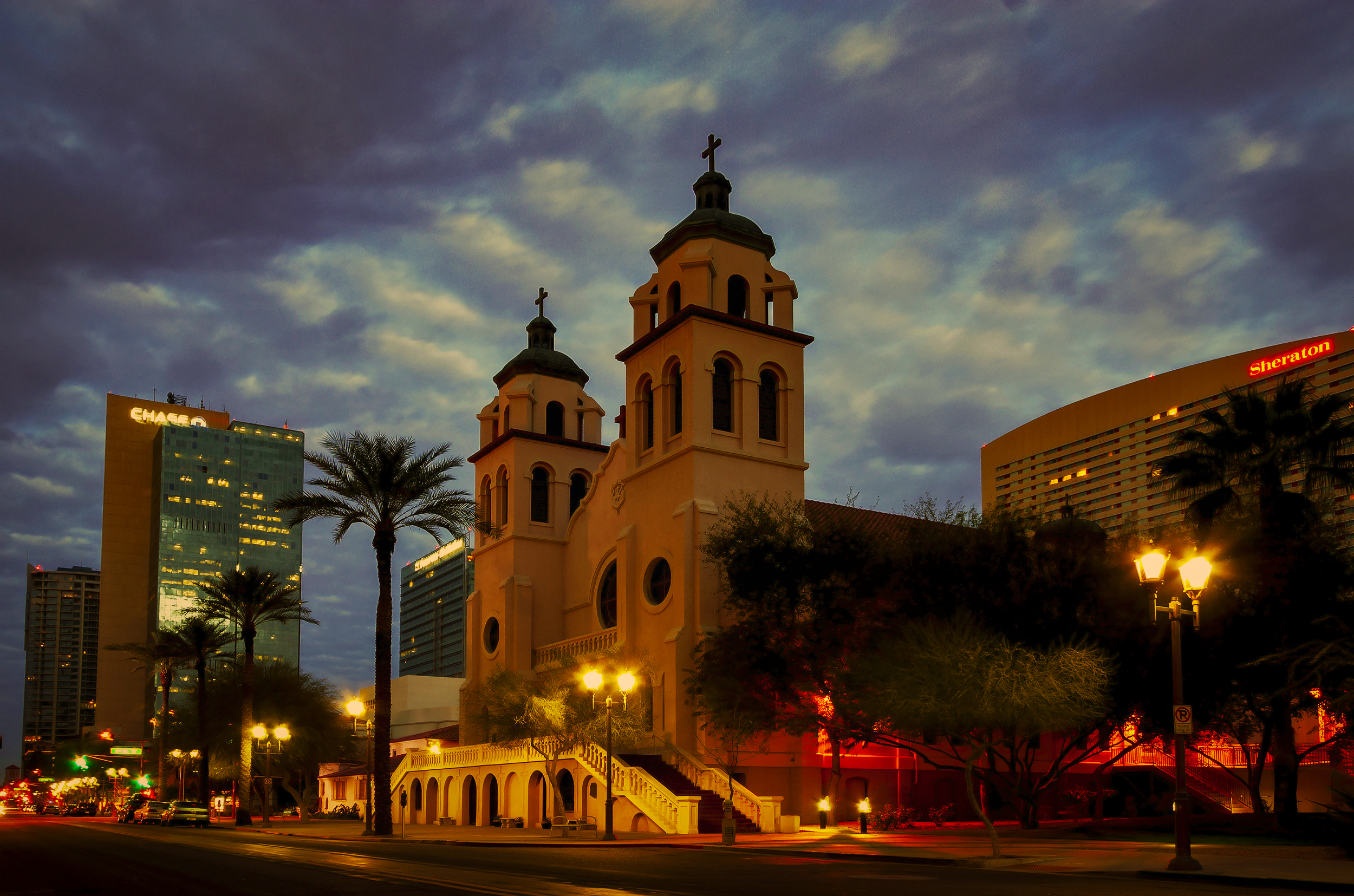
@sjarvie5
What I found most challenging about this edit was that I wanted to straighten the lines of the buildings a little more. But where to start? I found a tutorial about perspective warp and ruined the whole photo. Did it again. Ruined it again. Those straight lines just didn't want to look good. In the end, I found something in between that was satisfying enough...
Next, remove some trash from the street...
And then, cropping. I didn't really like the unsharpness of the building on the left. But cropping it out left me with the question that the hotel on the right should go too. And then I would be stuck with just the church. So I undid all the cropping and returned to my first setup. Also, because I like the effect the city lights have on the photo.
I liked what happened to the clouds when I added some contrast. I played with some sliders and before I knew it, the photo turned into this:
 Original
My edit
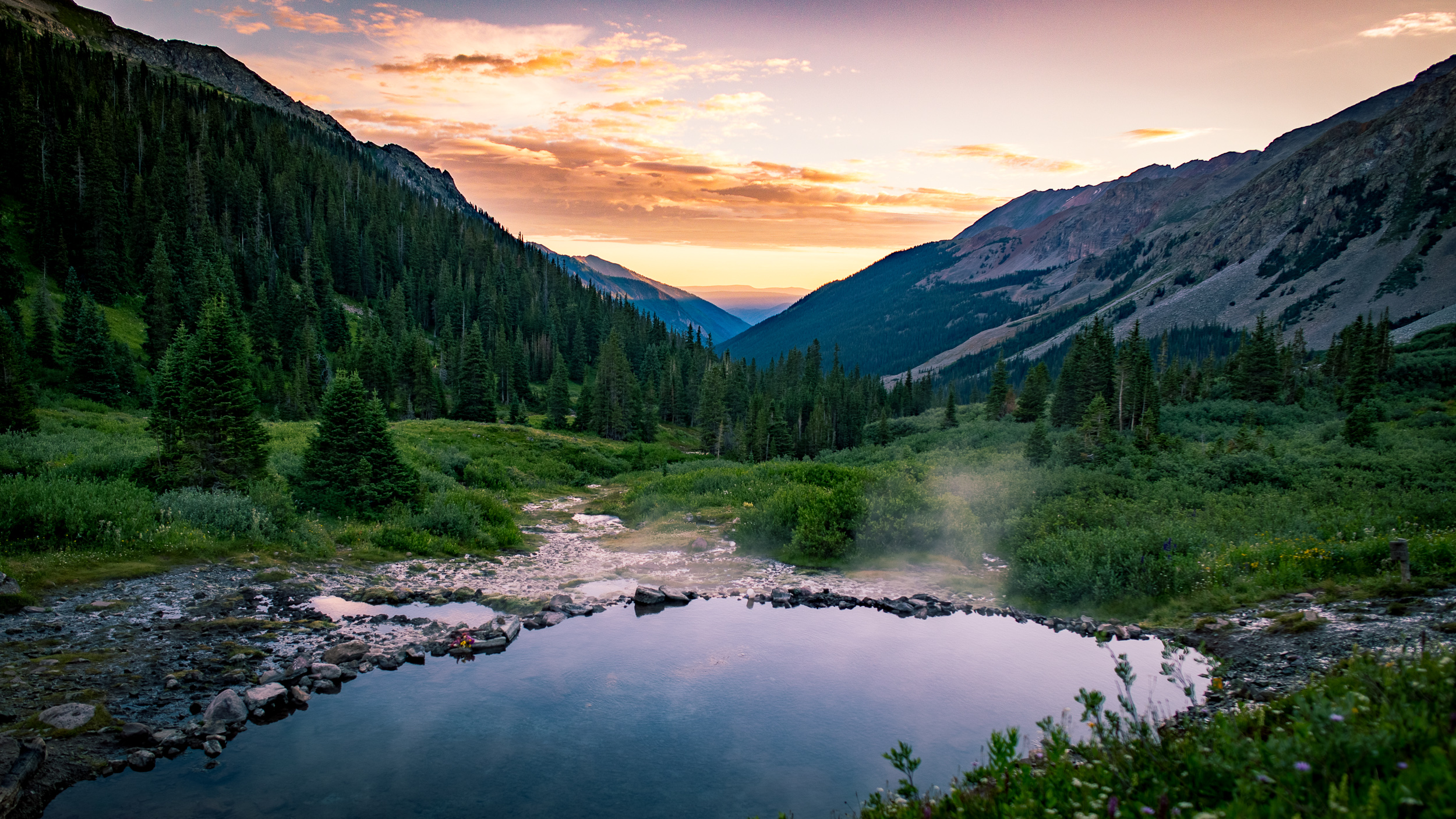
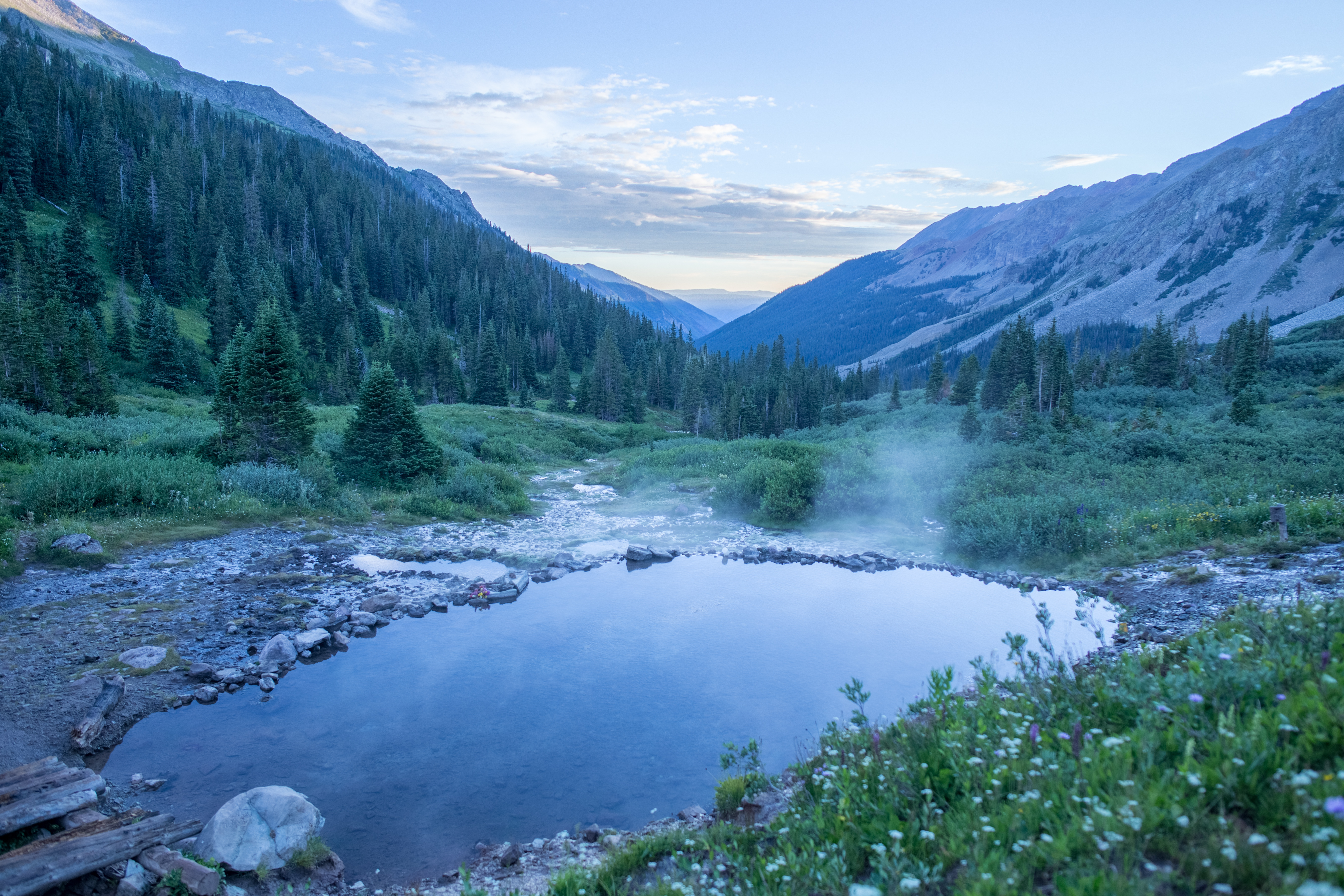
@aweber
Another thing that I had to conquer: Lightroom! My regular tool just didn't want to do the trick. It was just being mean to me. But then what?
What I normally do... just click everything and slide every slider and see what happens. Do a few auto things to see what it can turn into. Undo, redo... and all over again. I had to crop the distracting foreground a little, plus the tip of the left mountain was bugging me. But with 16x9, it all became much more to my liking.
Not an awful lot of work this time, but the photo was already gorgeous. It just lacked a bit of colour according to this colour junkie 😎.
 Original
My edit