
A tranquil, almost fantastical crystal cave.
First, I started with simple depth in the scene by layering. You use decreasing saturation and brightness for each further layer. The main problem is that I started with incredibly dark tones.

Saturated colors and brightness make an artwork stand out of the sea of art. In cases where you need to use a lot of desaturated or dark colors, you can balance out the composition with some strong contrasts. Moreover, often when posting my art online, I notice that it's more bleak than what it was while I was painting it.
Secondly, I had to decide what the cave would contain. I considered between a gold mine, underground lake and crystal cave. As I had only few hours to get the painting done, I decided the easier and shiniest option: crystal cave.

As the background is very blue and cold, warm colored crystals will stand out best. I chose pink over yellow or orange, because of my personal preference. Red would look more like rubies, which are different shape and less abundant than crystals.

I concentrated on having variety of crystal shapes over making each look perfect. This makes the cave look more natural and takes me less time to draw. Moreover, to save time I used many layers several layer adjustments. This allowes me to adjust things later and to modify the composition easily.
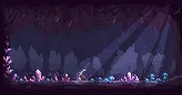
For the light rays I used "overlay" blend mode as it looked more appealing than just using low opacity. Also it's light blue color not simply white, adding more saturation to the painting.

After the crystals and a bit of mushrooms, I felt the objects were too repetitive so I added a pickaxe. Conveniently it also provides an approximate scale reference for the viewer. Using a human for scale is a common and very useful trick, but using a recognizable object works just as well and it's easier.
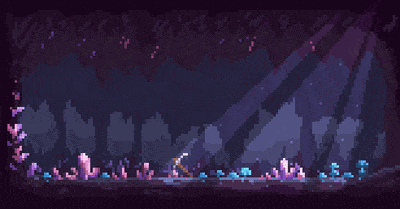
Finally, I kept the animation very simple, with only 4 frames. However, a little shine and light dust nicely complete the whole scene.
All of the art in this post was made by me, copyright

Thank you for reading!