I was eyeing other people's entries for a while before I decided to make my own.
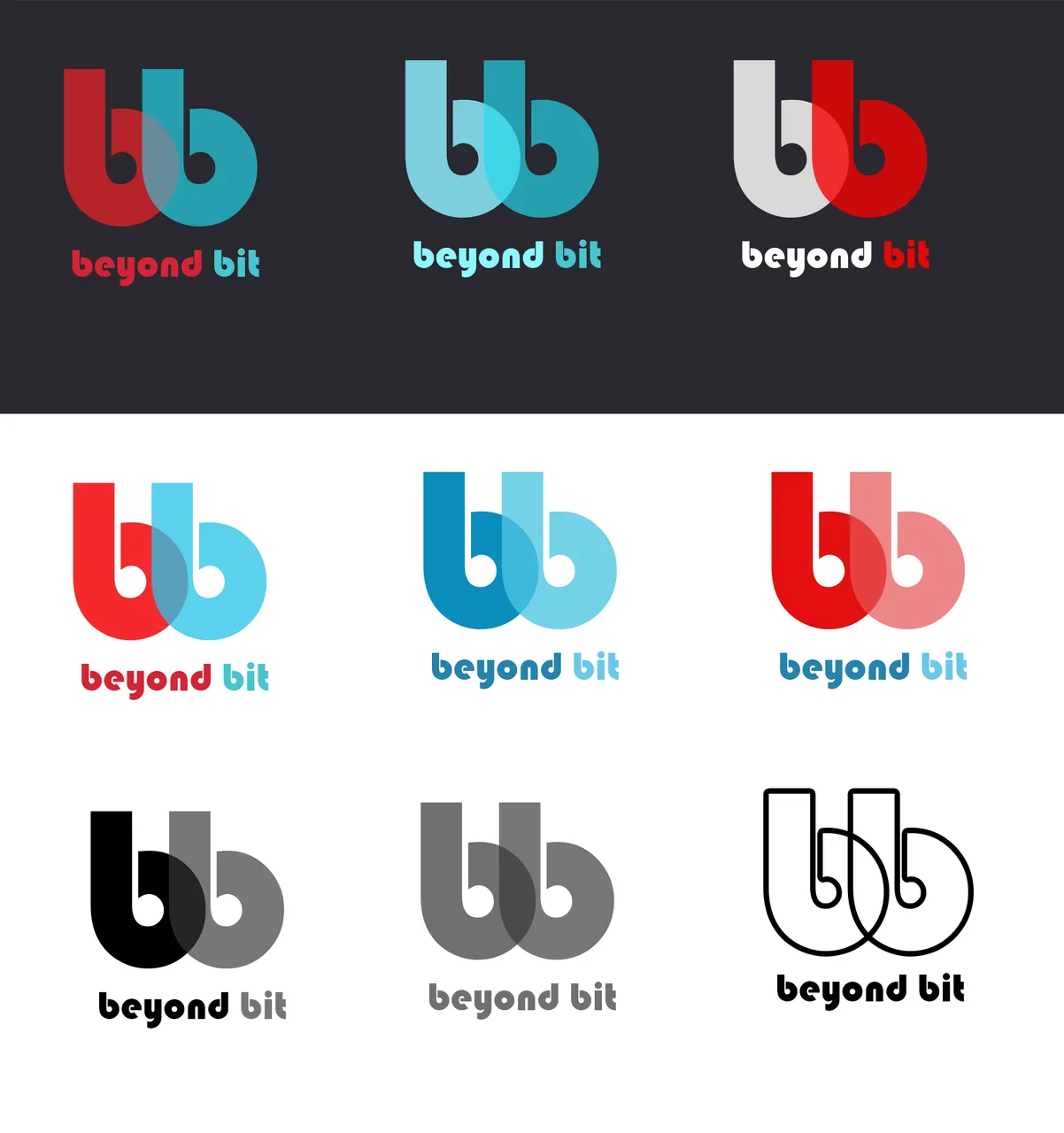
So, Beyond Bit needs a logo and I made 2 styles with plenty variations :)
1. Minimalist Approach.
One letter "b" is standing beyond another, emphasizing the tagline.

Different colors on light and dark background:

2. Tied together.
This one would need a little bit more work on the shape, but the concept is close enough to the finished look.


Let me know which one you like the best!
Bitshares acc, just in case :)
ptimiya1
#374127