Steemians’ preferred themes are Steemians, Steem and Steemit, I noticed. (I would say: themselves.) Many are sad after the recent price falls of Steem, and some are optimistic because there are, allegedly, worst altcoins than Steem. I better interrupt my series of deadly stocks and toxic commodities to explain you something.
One of the most cited quotes of the world could be this from Winston Churchill, who said:
“I only believe in statistics that I doctored myself” (Goodreads.com)
Beware of false counterfeiters
Other sources are using the verbs “manipulated” or “falsified” instead of “doctored”. Some indicate “it is in fact Nazi propaganda trying to discredit the statesman”. (here). But enough about Churchill, let’s return to Steem.
Sometimes, one chart tells you more than thousand words. Sometimes, charts are trying to fool you. Let’s see some:
The Good:

As you see, Steem price was up a lot, skyrocketing most part of the last 1,5 years. In the last months, it sank a little bit lower, of course, but surely only the general crypto-bear market, you know... It stands still much higher than 18 months ago. Move on, nothing to see here.
The Bad:

What happened here? Steem price falling? Yes, this is another chart, “year to date”, a standard comparison period. How bad, Steem price fell from 5-6 USD to under 1. “You chose the wrong period, dude, and other altcoins fell much more” – I can imagine what some Steemians will comment here.
Sure, you are right. I only wanted to show how a simple trick, changing the starting point of the chart, can influence seriously the results. That is, may be, the simplest trick of statistical presentations or market analysis, almost kiddy. Much bigger monsters are lurking out there in the woods of internet to show you fake facts.
The Ugly:
Let’s fool around a little more with the same chart, let’s compress it from the side and stretch it downstairs to make it tallish. And change the friendly, soothing green colour of Steem to an alarming, nerve-racking, bloody red:
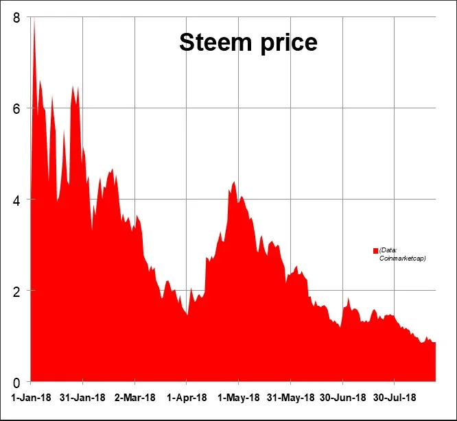
The result is an ugly, annoying Steem price chart, with the line seemingly in free fall. In reality, an 80-90 percent fall in the traditional world would be very alarming, last time it happened with the S&P 500 index after the stock exchange crash in 1929, I think, in the Great Depression. But in the crypro world, it seems to be relatively normal, Bitcoin upreared several times from similar depths.
Absolute highs and lows
Some interesting data: The first daily closing price in the data set of Coinmarketcap.com is 0.87768 USD, from April 18, 2016. Todays, price, by 0.8599, indicates only a slight change in more than two years. Nothing happened in two years? I don’t think so.
The all time low was by 0.07217, means, only seven cents (!), March 12, 2017. Close to the beginning point of our “good graph”. The all time high by 8.03 Dollars, close to the beginning of the “bad” and the ugly graph line. This great day was January 3, 2017.
Like the standards
What to use if this graphs are manipulated? I suggest standard time periods, like 6 months, 1, 2, 3, 5, 10 years, if available. And may be you should compare it with some well known other asset. Steemit acts like other altcoins, underperforming Bitcoin this year. The last graphs at the end show you how much. (Source: Stooq.com); why they use 5 months period instead of 6 months, I don’t know, but it’s their standard.)
Motto of the series Plankton Microwhale School:
People are not interested in you. They are not interested in me. They are interested in themselves – morning, noon and after dinner. (Dale Carnegie: How To Win Friends And Influence People)


