After a really consuming Wednesday, I woke up this morning to a nice - and very useful - addition to the Steemit UI. Before that, I will briefly note that some of the confirmation alerts - on the Market section - have been revamped too, as you can see below.

Also, the rewards redeem area is now more visible and on the same color theme with the website.

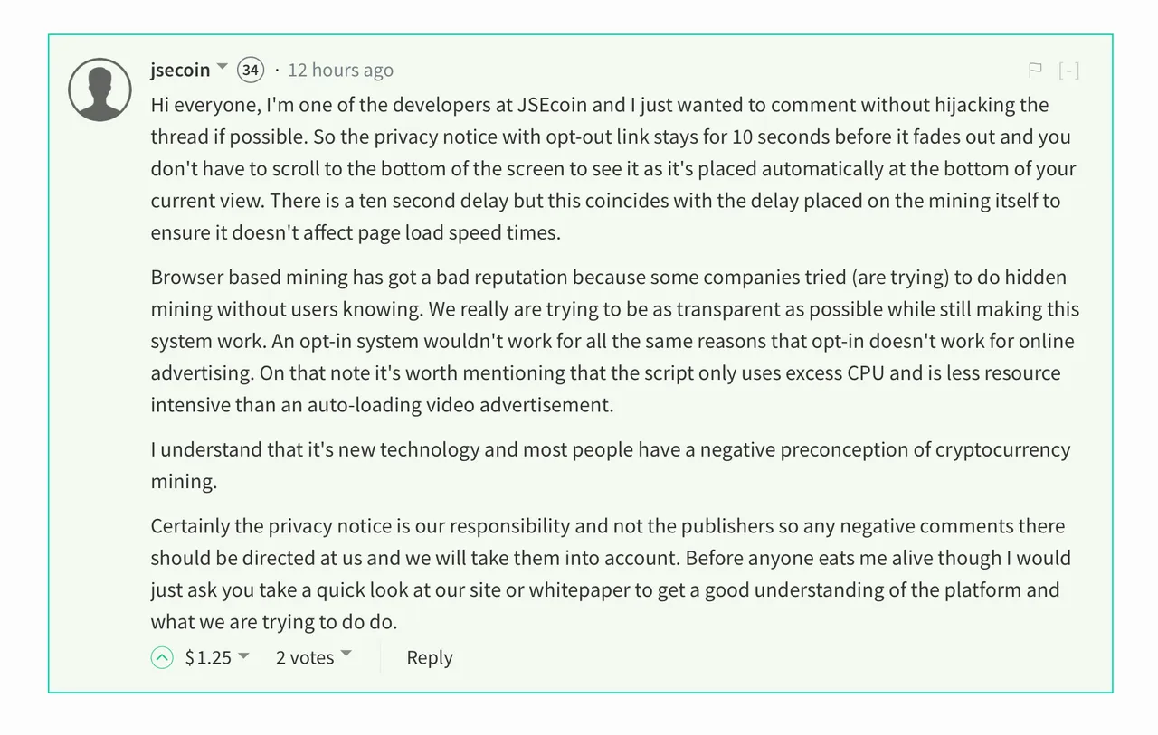
But the most important update is the one in the first screenshot: now the highlighted comments get a nice green border and a light teal background (I'm not good with colors, so that might not be teal).
I also confess that I took a very specific screenshot, namely of a comment related to the recent steem.supply accusations. I'm happy that somebody from JSEcoin joined the conversation and said loud and clear:
Certainly the privacy notice is our responsibility and not the publishers so any negative comments there should be directed at us and we will take them into account.
One of the upvotes received by this comment is coming from 
So, as far as I'm concerned, the "browser mining" drama is ending here.
Back to work.
I'm a serial entrepreneur, blogger and ultrarunner. You can find me mainly on my blog at Dragos Roua where I write about productivity, business, relationships and running. Here on Steemit you may stay updated by following me 

https://steemit.com/~witnesses
If you're new to Steemit, you may find these articles relevant (that's also part of my witness activity to support new members of the platform):