Hi Steemers!
Here are my new mockups based on the feedback I received. They are a continuity of the previous themes that I have created last weekend (https://steemit.com/steemit/@dudutaulois/is-this-the-new-steemit)
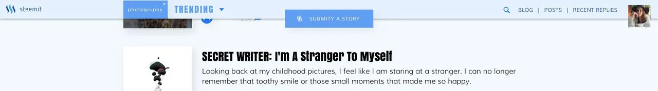
Since some people prefer compact layouts that allows to see more itens on the screen rather to have big images I moved some elements like the wallet to a hidden sidebar (just like the notifications bar on OS X). There is plenty of room there to include other things like recent replies and so on.
The header elements also got squeezed when the user scrolls downs the page. Thank 
These are small tweaks that I believe could bring a better experience using Steemit.
I also would like to create another complete different theme that I should post latter this week.