
I feel mobile functionality is a crucial aspect for the platform’s growth so I’ve been working on some early yet advanced ideas in the last couple of weeks envisioning how the official Steemit’s app could look and work.
My intention was to improve current functionality only, except for some very small additions and changes.
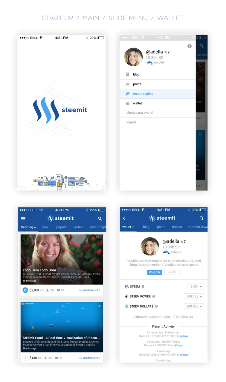
The following is the final result composed of four main screens: start up, home, menu and wallet/profile. I’ve also added the recently implemented reputation system plus the only unique feature I would like to see included ( "Whale Status”).
The goal was to achieve and overall improve unity, hierarchy, spacing and contrast of all current elements.


You can test the prototype on your iOS device. Please check if you have iOS Viewer app installed first (don't worry, it's free).

Special thanks to 