Details
MY PROPOSED DESIGN

Source:
https://github.com/HenriDellal/emerald
https://play.google.com/store/apps/details?id=ru.henridellal.emerald&hl=tr
LIGHT AND DARK COLOR

BLACK/WHITE

DIFFERENCE SIZES

LOGO COMPARISON

CONCEPT

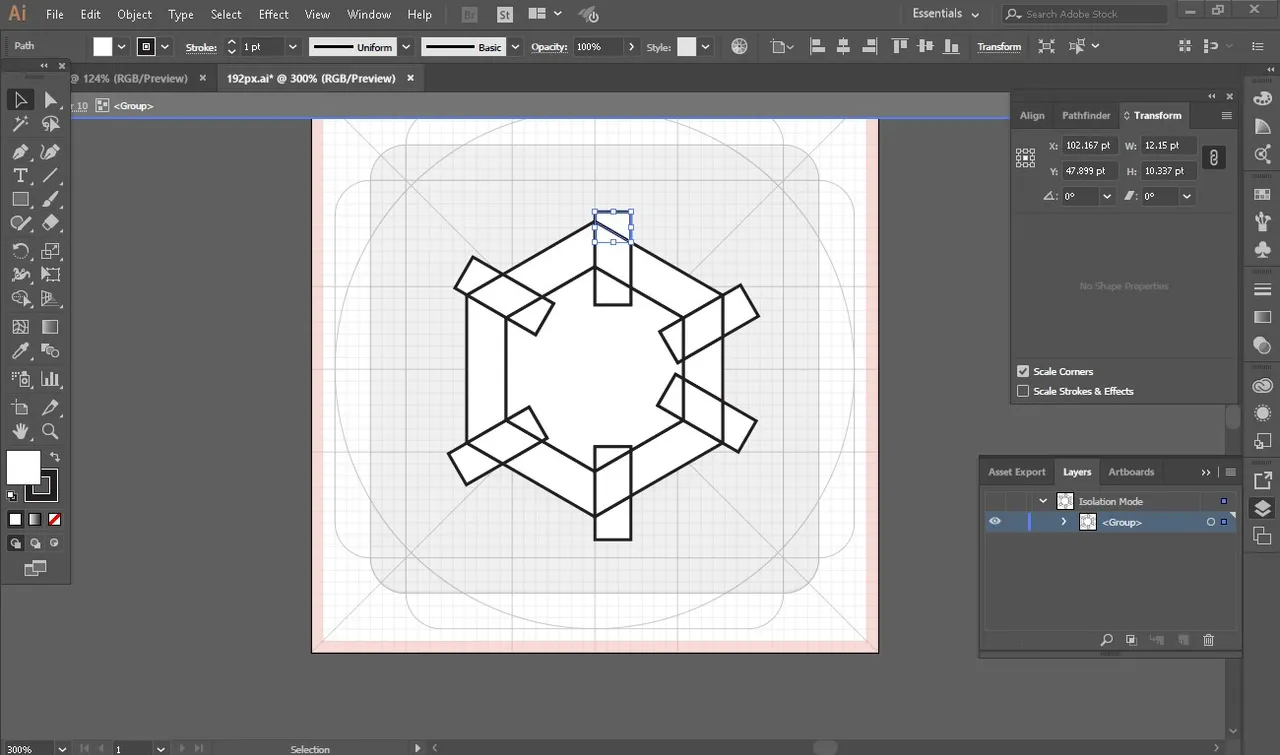
I used the polygon to make letter "e" stands for emerald launcher. As you can see, it is also look like a top view gemstone. Emerald symbolized clean and fresh, it is something like unique appearance as Emerald Launcher supports icon packs and layout customization.
My design is more attractive but simple comparing from existing logo.
MY WORK USING ADOBE ILLUSTRATOR CC 2017


Original files
https://drive.google.com/drive/folders/1AOpYm7n7tzsUzRbtF60oe6rCciRmofqh?usp=sharing
Posted on Utopian.io - Rewarding Open Source Contributors