Bootstrap
Build responsive, mobile-first projects on the web with the world's most popular front-end component library. Bootstrap is an open source toolkit for developing with HTML, CSS, and JS. Quickly prototype your ideas or build your entire app with our Sass variables and mixins, responsive grid system, extensive prebuilt components, and powerful plugins built on jQuery.

Image Source
Repository https://github.com/twbs/bootstrap
| What Will I Learn? |
|---|
| - We will learn how to create a responsive "timeline" with Bootstrap |
| - We will code our About Us section appropriately to our design. |
| Requirements |
|---|
| - Brackets (Website) |
| - Intermediate code knowledge |
| - Basic HTML and CSS knowledge |
| Difficulty |
|---|
| - Intermediate |
Curriculum
Part 1: Bootstrap One-Page Web Design #Part1 [Turkish Tutorial]
Part 2: Bootstrap One-Page Web Design #Part2 [Turkish Tutorial]
Part 3: Bootstrap One-Page Web Design #Part3 [Turkish Tutorial]
Part 4: Bootstrap One-Page Web Design #Part4 [Turkish Tutorial]
Part 5: Bootstrap One-Page Web Design #Part5 [Turkish Tutorial]
Part 6: Bootstrap One-Page Web Design #Part6 [Turkish Tutorial]
Part 7: Bootstrap One-Page Web Design #Part7 [Turkish Tutorial]
Part 8: Bootstrap One-Page Web Design #Part8 [Tutorial]
Part 9: Bootstrap One-Page Web Design #Part9 [Tutorial]
Part 10: Bootstrap One-Page Web Design #Part10 [Tutorial]
Part 11: Bootstrap One-Page Web Design #Part11 [Tutorial]
Part 12: You are now here.
Tutorial Contents
In our previous lesson, we coded our Portfolio section with the modal feature of Bootstrap. In this lesson we will add a About Us section with a responsive "timeline" feature.

First of all, we will create the grid structure of our About Us section. Let's start by coding our index.html page.
Create a section tag containing our About Us section.
<section id="aboutUs">
</section>
Here we have defined the aboutUs id. As we talked in our previous lessons, with this id, we will link the About Us section to the navigation menu.
Keep coding. Now we have to create a container inside the section tag.
<section id="aboutUs">
      <div class="container">
      </div>
</section>
The About Us section will consist of two parts, just like the Portfolio section. The first part will contain a title and a subtitle. Let's code them first.
<section id="aboutUs">
        <div class="container">
            <div class="aboutUs-top">
                <h3>ABOUT US</h3>
                <p>Proin iaculis purus consequat sem cure.</p>
            </div>
   </div>
</section>
Here we have created the first part. We have added a header and a paragraph into the aboutUs-top class.
Let's save our codes and check our page.

Let's code the second part of our About Us section.
We will start by creating a div class called aboutUs-content and define five row classes inside it. We will split each row into three equal columns and fill each column with our about us contents.

<section id="aboutUs">
        <div class="container">
            <div class="aboutUs-top">
                <h3>ABOUT US</h3>
                <p>Proin iaculis purus consequat sem cure.</p>
            </div>
            <div class="aboutUs-content">
                <div class="row">
               </div>
                <div class="row">
               </div>
                <div class="row">
               </div>
                <div class="row">
               </div>
               <div class="row">
               </div>
           </div>
        </div>
</section>
We have created our five row classes. Using the information we learned in our previous lessons, we will divide each row into three columns. You know that, a row in Bootstrap consists of twelve columns. We will use the col-sm-4 class for the three columns we want. (12/3 = 4) Let's code first row class. We will fill first and second column. Our third column will be empty.
<section id="aboutUs">
<div class="container">
<div class="aboutUs-top">
<h3>ABOUT US</h3>
<p>Proin iaculis purus consequat sem cure.</p>
</div>
<div class="aboutUs-content">
<div class="row">
<div class="col-sm-4">
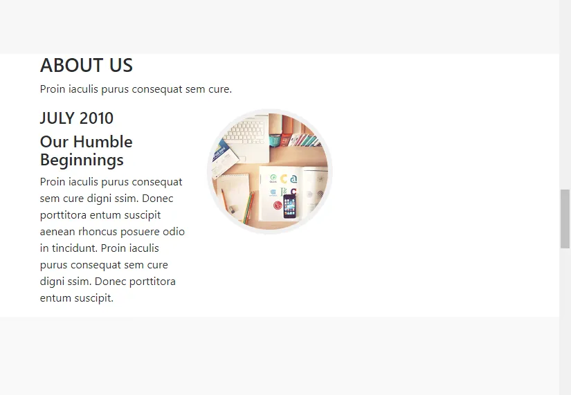
<h4>JULY 2010</h4>
<h4>Our Humble Beginnings</h4>
<p>Proin iaculis purus consequat sem cure digni ssim. Donec porttitora entum suscipit aenean rhoncus posuere odio in tincidunt. Proin iaculis purus consequat sem cure digni ssim. Donec porttitora entum suscipit.</p>
</div>
<div class="col-sm-4">
<img src="images/aboutUs1.png"/>
</div>
</div>
<div class="row">
</div>
<div class="row">
</div>
<div class="row">
</div>
<div class="row">
</div>
</div>
</div>
</section>
Let's save our codes and check our page.
Now let's code the other rows and columns according to our design. The final version of our codes should look like this:
<section id="aboutUs">
<div class="container">
<div class="aboutUs-top">
<h3>ABOUT US</h3>
<p>Proin iaculis purus consequat sem cure.</p>
</div>
<div class="aboutUs-content">
<div class="row">
<div class="col-sm-4">
<h4>JULY 2010</h4>
<h4>Our Humble Beginnings</h4>
<p>Proin iaculis purus consequat sem cure digni ssim. Donec porttitora entum suscipit aenean rhoncus posuere odio in tincidunt. Proin iaculis purus consequat sem cure digni ssim. Donec porttitora entum suscipit.</p>
</div>
<div class="col-sm-4">
<img src="images/aboutUs1.png"/>
</div>
</div>
<div class="row">
<div class="col-sm-4">
<img src="images/aboutUs2.png"/>
</div>
<div class="col-sm-4">
<h4>JANUARY 2011</h4>
<h4>Facing Startup Battles</h4>
<p>Proin iaculis purus consequat sem cure digni ssim. Donec porttitora entum suscipit aenean rhoncus posuere odio in tincidunt. Proin iaculis purus consequat sem cure digni ssim. Donec porttitora entum suscipit.</p>
</div>
</div>
<div class="row">
<div class="col-sm-4">
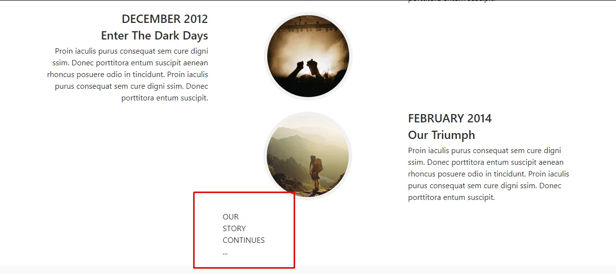
<h4>DECEMBER 2012</h4>
<h4>Enter The Dark Days</h4>
<p>Proin iaculis purus consequat sem cure digni ssim. Donec porttitora entum suscipit aenean rhoncus posuere odio in tincidunt. Proin iaculis purus consequat sem cure digni ssim. Donec porttitora entum suscipit.</p>
</div>
<div class="col-sm-4">
<img src="images/aboutUs3.png"/>
</div>
</div>
<div class="row">
<div class="col-sm-4">
<img src="images/aboutUs4.png"/>
</div>
<div class="col-sm-4">
<h4>FEBRUARY 2014</h4>
<h4>Our Triumph</h4>
<p>Proin iaculis purus consequat sem cure digni ssim. Donec porttitora entum suscipit aenean rhoncus posuere odio in tincidunt. Proin iaculis purus consequat sem cure digni ssim. Donec porttitora entum suscipit.</p>
</div>
</div>
<div class="row">
<div class="col-sm-4">
<div class="about-circle">
<p>OUR<br>
STORY<br>
CONTINUES<br>
...</p>
</div>
</div>
</div>
</div>
</div>
</section>
Let's save our codes and check our page.

About Us section is not like as what we wanted, is it? Now let's look at Bootstrap's offset class feature. Go to Bootstrap's Documentation page and follow the Layout>>Grid>>Offsetting Columns


We will move columns to the right using offset-sm-4 classes. Firstly, add the offset-sm-4 to the second row like as the picture:

Let's save our codes and check our page.

Let's do the text right-justify at first row with using text-right class. Then, center the image with using text-center class. Do the same things for the second row. Center the image with using text-center class.
Let's take a look our page.

Let's apply everything we do in the first two rows to the other rows. The codes for the first four rows are as follows:
                <div class="row">
                    <div class="col-sm-4 text-right">
                        <h4>JULY 2010</h4>
                        <h4>Our Humble Beginnings</h4>
                        <p>Proin iaculis purus consequat sem cure digni ssim. Donec porttitora entum suscipit aenean rhoncus posuere odio in tincidunt. Proin iaculis purus consequat sem cure digni ssim. Donec porttitora entum suscipit.</p>
                    </div>
                    <div class="col-sm-4 text-center">
                        <img src="images/aboutUs1.png"/>
                    </div>
                </div>
                <div class="row">
                    <div class="col-sm-4 offset-sm-4 text-center">
                        <img src="images/aboutUs2.png"/>
                    </div>
                    <div class="col-sm-4">
                        <h4>JANUARY 2011</h4>
                        <h4>Facing Startup Battles</h4>
                        <p>Proin iaculis purus consequat sem cure digni ssim. Donec porttitora entum suscipit aenean rhoncus posuere odio in tincidunt. Proin iaculis purus consequat sem cure digni ssim. Donec porttitora entum suscipit.</p>
                    </div>
                </div>
                <div class="row">
                    <div class="col-sm-4 text-right">
                        <h4>DECEMBER 2012</h4>
                        <h4>Enter The Dark Days</h4>
                        <p>Proin iaculis purus consequat sem cure digni ssim. Donec porttitora entum suscipit aenean rhoncus posuere odio in tincidunt. Proin iaculis purus consequat sem cure digni ssim. Donec porttitora entum suscipit.</p>
                    </div>
                    <div class="col-sm-4 text-center">
                        <img src="images/aboutUs3.png"/>
                    </div>
                </div>
                <div class="row">
                    <div class="col-sm-4 offset-sm-4 text-center">
                        <img src="images/aboutUs4.png"/>
                    </div>
                    <div class="col-sm-4">
                        <h4>FEBRUARY 2014</h4>
                        <h4>Our Triumph</h4>
                        <p>Proin iaculis purus consequat sem cure digni ssim. Donec porttitora entum suscipit aenean rhoncus posuere odio in tincidunt. Proin iaculis purus consequat sem cure digni ssim. Donec porttitora entum suscipit.</p>
                    </div>
                </div>
Come to the last row.
                    <div class="col-sm-4">
                        <div class="about-circle">
                            <p>OUR<br>
                              STORY<br>
                              CONTINUES<br>
                              ...</p>
                        </div>
                    </div>
 </div>
We will add offset-sm-4 class and let the text come under the pictures. Then, add yellow-text class to our p tag.
                    <div class="col-sm-4 offset-sm-4">
                        <div class="about-circle">
                            <p class="yellow-text">OUR<br>
                              STORY<br>
                              CONTINUES<br>
                              ...</p>
                        </div>
                    </div>
  </div>
Before editing main.css file, add text-center class right next to aboutUs-top class. Now let's open and edit our main.css file.
#aboutUs {
    padding-top: 120px;
    padding-bottom: 30px;
}
We defined the value of padding as 120 pixel from top and 30 pixel from bottom.
.aboutUs-top h3 {
    font-family: 'Montserrat', sans-serif;
    font-size: 40px;
    font-weight: 700;
}
We set the font of the header h3 tag in the aboutUs-top class as Montserrat. We set the font size to 40 pixel and set the font to bold.
.aboutUs-top p {
    font-family: 'Droid Serif', serif;
    font-size: 16px;
    font-style: italic;
    color: #777;
    margin-bottom: 70px;
}
We set the font of the paragraph p tag in the aboutUs-top class as Droid Serif. We set the font size to 16 pixel and set the font color to #777. Margin-bottom has set to 70 pixel. And also font style is italic.
.aboutUs-content .row {
    margin-bottom: 90px;
}
Margin-bottom has set to 90 pixel for each row class on the aboutUs-content class.
.aboutUs-content h4 {
    font-family: 'Montserrat', sans-serif;
    font-size: 18px;
    font-weight: 700;
}
We set the font of the header h4 tag in the aboutUs-content class as Montserrat. We set the font size to 18 pixel and set the font to bold.
.aboutUs-content p {
    font-family: 'Roboto Slab', serif;
    font-size: 14px;
    color: #777;
}
We set the font of the header p tag in the aboutUs-content class as Roboto Slab. We set the font size to 14 pixel.
Let's start adding the timeline.
.aboutUs-content{
    position: relative;
}
We activated the interaction between objects and timeline in the aboutUs-content class. We will insert our timeline before the content of aboutUs-content class:
.aboutUs-content:before {
    top: 0;
    bottom: 0;
    position: absolute;
    content: " ";
    width: 4px;
    background-color: #f1f1f1;
    left: 50%;
    margin-left: -2px;
}
By positioning our timeline in an absolute position, we ensure that it takes its position relative to aboutUs-content class that covers it.
left: 50%; >> We centered the timeline.
margin-left: -2px; >> We have exactly centered our timeline by taking 2 pixel (half the thickness) back.
Let's take a look our page.

Finally, format our yellow circle.
.about-circle {
    position: relative;
    text-align: center;
}
We centered the text. We will create a circle in the same format as the timeline.
.about-circle:before {
    top: 0;
    bottom: 0;
    position: absolute;
    content:" ";
    width: 176px;
    height: 176px;
    background-color: #fed136;
    border-radius: 170px;
    border: 7px solid #f1f1f1;
    left: 50%;
    margin-left: -89px;
}
We created our circle.
margin-left: -89px; >> We centered our circle by pulling left as far as the radius of the circle.
Now let's edit the text with yellow-text class.
.about-circle .yellow-text {
    position: relative;
    z-index: 1;
    padding-top: 40px;
    font-family: 'Montserrat', sans-serif;
    font-size: 18px;
    font-weight: 700;
    color: white;
}
z-index: 1; >> We made our text appear in the upper layer.
padding-top: 40px; >>We have given this value because we measured the distance between the text and the circle by 40 pixels. We coded all other parameters (such as font type, color and size) to be the same as our design.
Let's save our codes and check our page.


It looks pretty good. We came to the end of this part of our education. Thank you for your interest.