Hi 
This is a really good simple design, the concept itself is good by combining a folder and cloud and yet the logo still looks simple and recognizeable even in small size. In your source files (.svg) the logo is a little bit different though with the one that you show in your presentation. As you can see bellow, the logomark and logotype in your source files has different widht.
(In your gdrive)

(in your presentation)

Also i can only find .svg files as your editable files, it would be better to add another file wih different extension such as .eps or .pdf.
Talking about your presentation, explaining the benefits in bullet poin is a plus, i really like it. One think you might want to nate is your mockup.
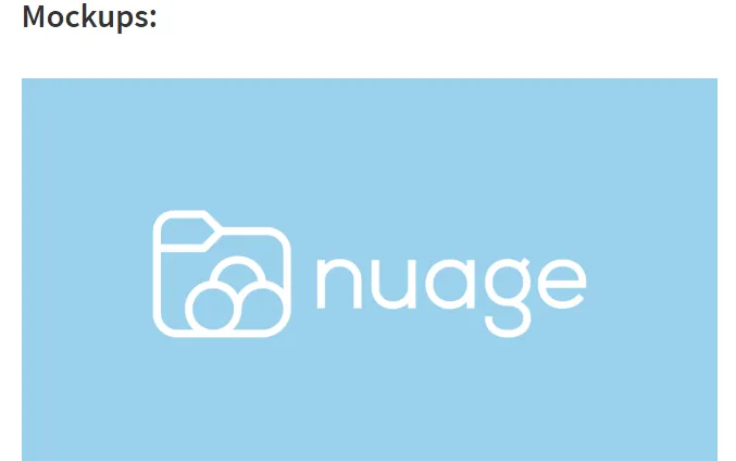
Mockup is a model that people use to show how their designs looks in real life, i see you did show some mockups to project owner in the github issue, you should show some here in your presentation, think it like this is your portofolio, you want your presentation to look as good as possible.
Your contribution has been evaluated according to Utopian policies and guidelines, as well as a predefined set of questions pertaining to the category.
To view those questions and the relevant answers related to your post, click here.
Need help? Write a ticket on https://support.utopian.io/.
Chat with us on Discord.
[utopian-moderator]
RE: Logo Design for Nuage [Contribution] [Graphics]